Glass UI Is Everywhere. We've Been Using It Since 2023 — Here's What We Learned
Glass UI Is Everywhere. We've Been Using It Since 2023 — Here's What We Learned
Martina Garbolino
Martina Garbolino

Since iOS 26 launched, glass UI has become one of the most debated topics in digital design. Apple’s Liquid Glass introduced transparency, blur, and layered depth as a system-wide material — and the reaction has been sharply divided. Some designers see it as a bold evolution. Others call it a usability nightmare: text lost over busy backgrounds, contrast sacrificed for aesthetics, legibility treated as an afterthought.
It’s a fair debate. But for us, it’s not a new one.
Three years ago, when we began redesigning BCG.com, we introduced glass-based UI across key interaction surfaces. Not because it was trending — glassmorphism was circulating in design communities, but it hadn’t yet reached the mainstream saturation it has today. We used it because it solved real problems.
What we learned in that process is relevant to the current debate: glass doesn’t have to be a trade-off between beauty and usability. But only if you treat it as a design tool, not a design trend.

THE BRIEF: MORE CONVERSION, NO NEW FEATURES
When we took on the BCG.com redesign, we were working within a significant constraint. The development team was deep into building a new foundational design system, which meant our focus was on transforming existing features rather than creating new ones. The goal was clear: increase conversion and engagement by rethinking how users interacted with what was already there.
That meant taking features that were underperforming or easy to overlook — saving, downloading, sharing, subscribing, contacting — and making them more engaging, more findable, and more intuitive. We needed to do a lot with what we had.

WHY GLASS? BECAUSE DENSE INTERFACES NEED BREATHING ROOM.
BCG.com is a content-heavy environment. Research publications, executive insights, topic deep-dives — pages dense with information competing for attention. In that context, adding persistent interactive elements (widgets, CTAs, side-rails) creates a real tension: how do you keep key actions visible and accessible without making the interface feel heavier?
That’s where glass came in.
We used transparency and blur effects on our widget surfaces — the sticky side-rail that follows users down the page, contextual action panels, promo cards — to create visual depth without visual weight. Glass allowed these elements to feel present but not intrusive, layered on top of content without competing with it. This wasn’t a stylistic choice: it was an information hierarchy decision. Glass gave us a way to signal “this is interactive, this is available to you” while keeping the user’s primary focus on the content itself.

GLASS AS A SOLUTION TO READABILITY
One of the loudest criticisms of Apple’s Liquid Glass is that transparency hurts legibility — text becomes hard to read when it floats over complex or unpredictable backgrounds. It’s a valid concern, and one we anticipated.
On BCG.com, our insights promo cards needed to display text over editorial imagery. The content team needed freedom to choose images without worrying about whether a headline would be readable against a particular photo. That’s an operational constraint as much as a design one because you can’t scale a global content operation if every image needs manual contrast checking.
Glass solved this. By applying a controlled blur and transparency layer between the image and the text, we ensured consistent legibility regardless of the background.
It also solved a subtler problem. BCG.com hosts content from dozens of teams, practices, and regions — each with its own imagery and visual personality. Glass gave us a way to unify without flattening: a shared material layer that brings cohesion to the system while letting each piece of content keep its own identity underneath. The content team got full creative freedom. Readers got legible text. The system got cohesion without uniformity.
This is the distinction that often gets lost in the current debate: glass isn’t inherently a readability problem. Uncontrolled glass is a readability problem. When you calibrate the blur, the opacity, and the contrast intentionally, and when you test it against real content, not just a curated demo, glass actually improves readability in contexts where text meets unpredictable imagery.
THE WIDGET SYSTEM: WHERE GLASS MEETS CONVERSION
The glass treatment was part of a broader interaction design strategy. We consolidated BCG.com’s scattered action points (contact, save, download, share, subscribe, related content) into a standardised, persistent widget system. The primary implementation was a sticky side-rail: always accessible, always in the same position, following the users as they scroll.
The design principles behind it were deliberate:
Consistency across the ecosystem. The widgets sit in the same position on every relevant page. Users build familiarity fast, cognitive load drops, and the interaction becomes instinctive rather than exploratory. This is fundamental interaction design — Nielsen’s consistency heuristic in practice — but it’s remarkable how often it’s neglected on large-scale content platforms.
Context, not just presence. We didn’t just surface actions — we gave them meaning. The widgets provide subtle cues about what the user is doing and why they might want to take an action. The experience starts to feel conversational, as though the interface understands where you are in your journey and is offering relevant next steps, not generic buttons.
Adaptability and restraint. Not every page has the same layout or the same real estate. We designed the widgets to condense, reposition, or hide based on viewport and page type — always available, never in the way. Users can dismiss them. The system respects the user’s space and attention.


THE RESULTS
This is where design intent meets business impact.
The strategic implementation of these contextual widgets — glass-treated, persistent, behaviourally designed — delivered measurable improvements:
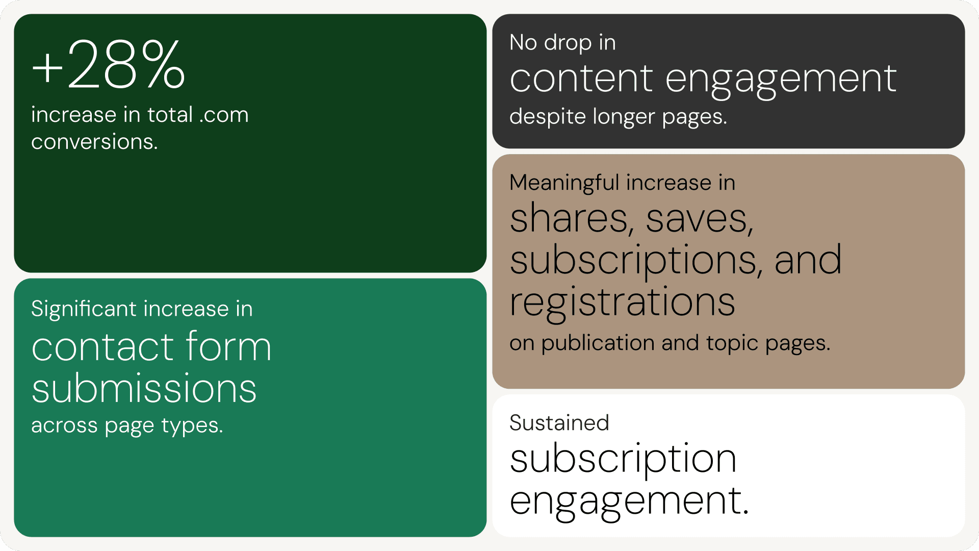
+28% increase in total site conversions. Importantly, conversions rose significantly more than visits. This wasn’t a traffic story. It was an engagement and action story — users on the site were doing more, more often.
Meaningful increase in shares, saves, subscriptions, and registrations on publication and topic pages, driven directly by the sticky side-rail’s persistent visibility.
Significant increase in contact form submissions across page types, driven by a strategically placed Contact Us CTA in the footer and bio page side-rail — with some page types seeing uplifts of over 100%.
Sustained subscription engagement, with article page side-rails and subscription modules remaining visible throughout the reading experience, making it easier for users to stay connected with BCG’s thought leadership content.
No drop in content engagement despite longer pages. Scroll rates held steady even as page height increased — meaning users were actually consuming more content than before. The added UI elements weren’t creating friction or overwhelming the experience. That’s the glass principle in practice: persistent, visible interaction surfaces that don’t weigh the page down.
These numbers weren’t achieved by building new features. They came from rethinking how existing features were presented, positioned, and surfaced — with glass as the material that made persistent UI feel light enough to live alongside dense content.
THE RESULTS
This is where design intent meets business impact.
The strategic implementation of these contextual widgets — glass-treated, persistent, behaviourally designed — delivered measurable improvements:
+28% increase in total site conversions. Importantly, conversions rose significantly more than visits. This wasn’t a traffic story. It was an engagement and action story — users on the site were doing more, more often.
Meaningful increase in shares, saves, subscriptions, and registrations on publication and topic pages, driven directly by the sticky side-rail’s persistent visibility.
Significant increase in contact form submissions across page types, driven by a strategically placed Contact Us CTA in the footer and bio page side-rail — with some page types seeing uplifts of over 100%.
Sustained subscription engagement, with article page side-rails and subscription modules remaining visible throughout the reading experience, making it easier for users to stay connected with BCG’s thought leadership content.
No drop in content engagement despite longer pages. Scroll rates held steady even as page height increased — meaning users were actually consuming more content than before. The added UI elements weren’t creating friction or overwhelming the experience. That’s the glass principle in practice: persistent, visible interaction surfaces that don’t weigh the page down.
These numbers weren’t achieved by building new features. They came from rethinking how existing features were presented, positioned, and surfaced — with glass as the material that made persistent UI feel light enough to live alongside dense content.
WHAT THE GLASS DEBATE GETS WRONG
The current conversation around glass UI tends to frame it as a binary: beautiful or usable. Trendy or functional. That framing misses the point.
Glass is a material. Like any material, it can be used well or badly. A glass wall in the wrong place is dangerous. A glass wall in the right place lets in light, creates openness, and connects spaces that would otherwise feel closed off. The same is true in interface design.
What made glass work on BCG.com wasn’t the effect itself. It was the intent behind every application. Every instance of transparency was there to solve a specific problem: reduce visual weight on persistent elements, ensure text legibility over unpredictable images, create hierarchy in dense layouts. None of it was there to look good in a screenshot.
That’s the question worth asking about any design material, glass or otherwise: is it earning its place, or is it just performing?
Trends come and go. Design intent stays.

Hungry for more insights?
Subscribe to our to stay up to date with industry standards.
Let’s talk
Ready to build something remarkable? We partner with ambitious teams who are serious about growth.
Contact Us
© 2026 Vicine
Hungry for more insights?
Subscribe to our to stay up to date with industry standards.
Let’s talk
Ready to build something remarkable? We partner with ambitious teams who are serious about growth.
Contact Us
© 2026 Vicine
Hungry for more insights?
Subscribe to our to stay up to date with industry standards.
Let’s talk
Ready to build something remarkable? We partner with ambitious teams who are serious about growth.
Contact Us
© 2026 Vicine