True brand identity work is architecture.
True brand identity work is architecture.
Francesca Oddenino
Francesca Oddenino
There's a lot of beautiful brand identity work out there right now. Gorgeous color palettes, elegant typography, slick mockups. Technically excellent. And a lot of it says absolutely nothing.
When looking away, it’s hard to remember what any of it was about. There's no story underneath the surface. No concept holding it together. No reason for it to look the way it does beyond the fact that it looks good. It's set design: stunning from the front, but walk behind it and there's plywood and nothing. It only works from one angle, for one moment. It was never built to be explored.
In a world optimized for scroll speed and visual impact, the incentive is to make something that stops a thumb. And surface-level work is very good at stopping thumbs. A striking color combination, a trendy typeface, a clever geometric mark. It photographs well. It gets featured. It gets likes. But it doesn't stay with anyone. A week later, you couldn't tell it apart from ten other identities that used the same mood board.
The work we find ourselves thinking about days, weeks, sometimes years later is always different. It has layers. And by layers we don't mean complexity for its own sake. We mean many facets of one narrative, showing up in different ways across different contexts, so that every time you encounter the brand you discover something new about it. The story deepens instead of repeating itself.
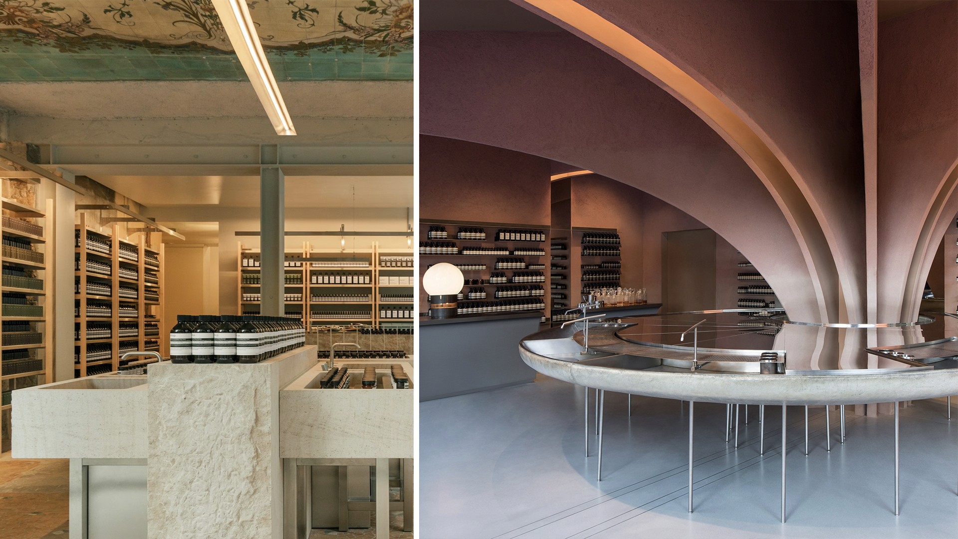
Think about Aesop. Every store is different, designed in response to the specific architecture and culture of its location, yet unmistakably Aesop. Instead of repeating a formula, the brand reinterprets a philosophy. You could visit ten Aesop stores and have ten different experiences that all feel like they belong to the same world. Just like a real building you can walk through, live in, and keep discovering.
Think about Aesop. Every store is different, designed in response to the specific architecture and culture of its location, yet unmistakably Aesop. Instead of repeating a formula, the brand reinterprets a philosophy. You could visit ten Aesop stores and have ten different experiences that all feel like they belong to the same world. Just like a real building you can walk through, live in, and keep discovering.

Or think about what Patagonia has built over decades. The brand isn't a logo or a color palette. It's a set of convictions that show up everywhere, from the "Don't Buy This Jacket" campaign to their Worn Wear program to the way their product descriptions read like field notes. Every touchpoint adds a new dimension to the same story. You understand Patagonia, learn to know it facet by facet, more deeply the longer you engage with it.
This is what we mean by architecture instead of set design. The surface is just one facet. Underneath it, there's a structure of meaning that rewards attention.

In our own work at Vicine, this is something we obsess over. When we designed the brand for Ahead, a longevity platform focused on early diagnostics, the obvious route would have been a clean, medical-looking identity.
Instead, we built the entire visual system around a single concept: revelation. Ahead's purpose is to uncover what's hidden in your body before it becomes a problem. So we made the brand do that, visually. The arrow in the logotype is a functional element that reappears throughout the entire system as a revealing tool, creating a consistent "from blur to clarity" effect across every touchpoint. It always moves in the same direction, left to right, bottom to top, literally enacting the transition from hidden to visible. Photography is framed by it. Content emerges through it. The tagline, "Your health revealed," is physically mirrored by the visuals.
This idea grew directly from the brand's commitments: putting people in the driver's seat of their health, refusing to blend in, treating patients as humans rather than cases. The arrow, the revealing motion, the progression from blur to clarity were just steps in helping make the strategy visible. You can't separate the look from the meaning because they're the same thing.
That's what we mean by architecture. You can walk through it. You can discover new connections the longer you spend with it. The visual identity and the brand strategy reinforce each other at every level, so that someone encountering Ahead for the tenth time is still finding something new. And I like to think that our work helped them achieve the traction and the success that they are currently experiencing.
While set design starts with "what looks good?" Architecture starts with "Is this going to last, stand the test of time?" and then “Are people going to love living in it?”
The other thing that resonates about the architecture metaphor is that brands, just like living spaces, should be built for interaction. They should be places where you feel comfortable and you’re happy to come back to again and again. To explore, to make yours.
Let's be frank: it has never been as easy as today to find cool references on Pinterest and assemble an identity that looks good on Behance. The tools are better than ever, the inspiration is infinite, the bar for "pretty" has never been lower. But pretty without meaning is just posturing. And the difference between posturing and real branding can always, always be spotted. Maybe not at first glance, maybe not in a thumbnail. But in the way it stays with you, or doesn't.
The brands that endure, the ones people build genuine loyalty to, are the ones where someone cared enough to build something you can actually walk into.
Hungry for more insights?
Subscribe to our to stay up to date with industry standards.
Let’s talk
Ready to build something remarkable? We partner with ambitious teams who are serious about growth.
Contact Us
© 2026 Vicine
Hungry for more insights?
Subscribe to our to stay up to date with industry standards.
Let’s talk
Ready to build something remarkable? We partner with ambitious teams who are serious about growth.
Contact Us
© 2026 Vicine
Hungry for more insights?
Subscribe to our to stay up to date with industry standards.
Let’s talk
Ready to build something remarkable? We partner with ambitious teams who are serious about growth.
Contact Us
© 2026 Vicine