4MINDS AI
A brand foundation for intelligent convergence
Industry
AI Infrastructure
Stage
Pre-Launch
Services
Brand Audit • Brand Identity • Iconography • Graphic System • Brand Guidelines & Toolkits • Templates • Handover
CONTEXT
4Minds is building genuinely novel AI infrastructure: self-improving private models that learn continuously during inference, paired with a proprietary knowledge graph for deeper reasoning. The product team had been moving fast and the brand had been moving with it, in pieces.
There was foundational strategic work in place, a name, a clean but generic logotype, and a growing amount of materials produced in-house. What was missing was a clear system that could be leveraged to build upon the brand consistently. The team was making case-by-case decisions every time something new needed to ship.
THE WORK
Over a six-week sprint, we audited what existed, separated the parts that were load-bearing from the parts that needed work, and produced a lean but rigorous set of brand guidelines covering logo (redesigned to add a meaningful logomark), typography, colour, iconography, graphic system, and photography direction.
Alongside the guidelines, we built a compact toolkit of operational templates (a PowerPoint master with designed live layouts, a Word template, a LinkedIn banner) and reviewed the work the in-house designer had produced to date with topline feedback for alignment. The engagement closed with a two-hour handover session with the internal team.
OUTCOME
4Minds came out of the sprint with a foundational ruleset that gives the team structure across essential brand elements without locking them into a heavy system they would outgrow.
The visual language now has a clear identity, an upgraded logo lockup now including a conceptually strong logomark with a documented gradient-stroke graphic treatment, a layered colour system anchored by cosmic blues, and a single-typeface system built on Acid Grotesk.
The team can now produce on-brand work without needing the studio in the loop, which is the actual point of a brand guidelines sprint.
Decide what was sacred and what could move
The Challenge
A brand built piece by piece collects momentum in some places and inconsistency in others. The first job before designing anything was to figure out which elements were load-bearing (and shouldn't be touched), which were close enough to keep with light tweaks, and which were missing entirely. Without that separation, every refinement risks either disrupting something the team had emotional ownership over, or papering over gaps that needed real attention.
What we did
We started with a structured assessment of the existing brand assets against the foundational strategic work the team had already done. We ran a one-hour collaborative session with the 4Minds team to clarify brand "sacredness" and alignment, surfacing what was non-negotiable and what was open. From there, we made light tweaks to assets that were close to working and outlined the gaps that the rest of the sprint would fill. This was a working brief and it set the pace for the next five weeks.
OUR PROCESS
Audited existing brand assets against the foundational strategic work already in place
Ran a collaborative session to surface what was non-negotiable and what was open
Separated the load-bearing elements from the gaps that needed real attention
Used that separation as the working brief for the rest of the sprint
OUR TOOLS
Brand Audit
Stakeholder Workshops
Scope Definition
Stakeholder Alignment


Build the system around what already worked
The Challenge
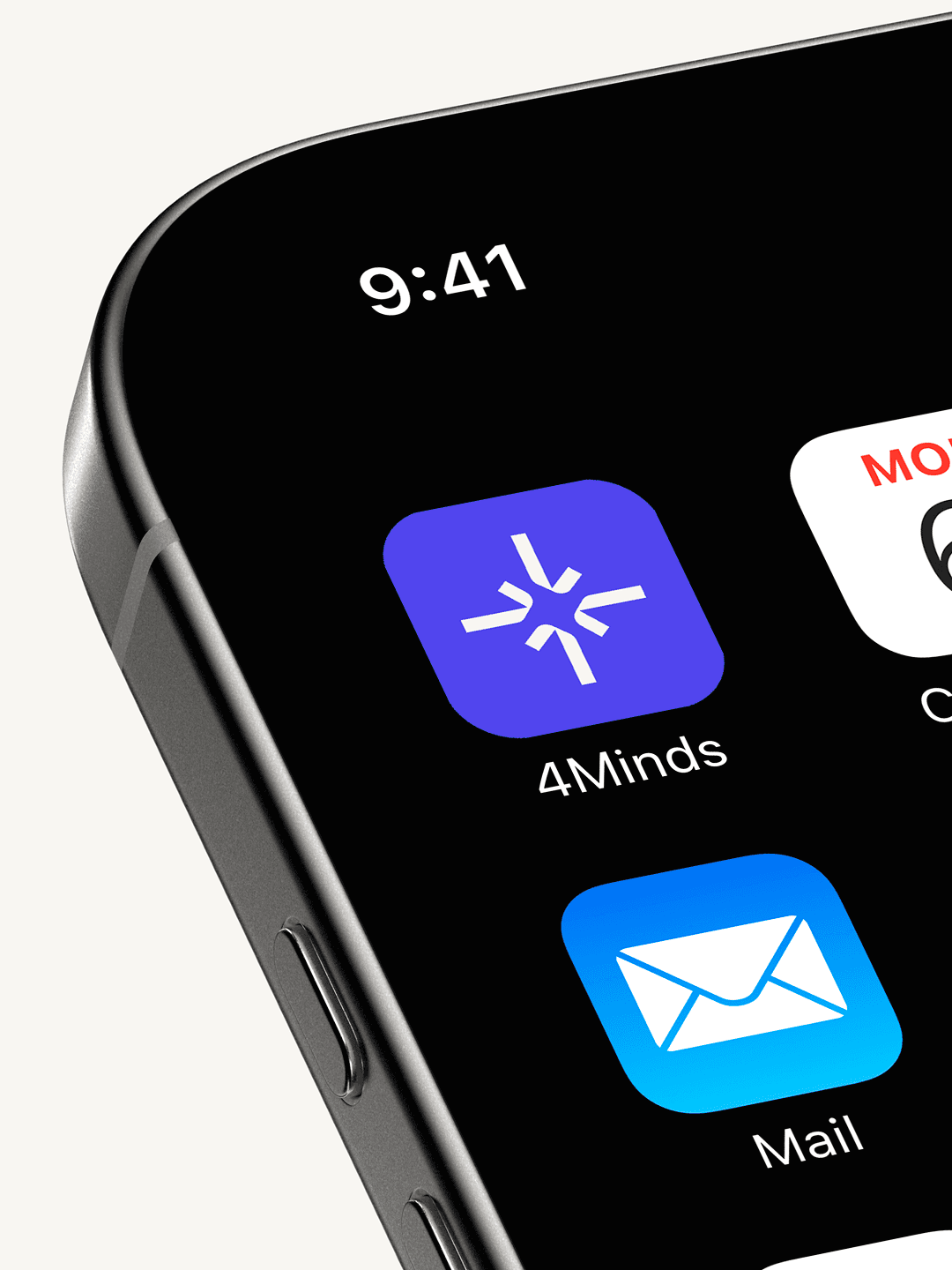
The four-arrow logomark and the strategic idea behind it (intelligent convergence) were our starting point for the identity. The brand needed a system around them: rules for the logo at every scale, a typographic foundation, a colour palette with documented behaviour, an iconography approach, and a graphic vocabulary the team could reach for. The constraint was scope. This was a sprint, not a deep-dive system, so the guidelines had to be lean enough to be read and used, but rigorous enough to actually hold the brand together.
What we did
We crafted a new logo and documented its lockup, clear-space, positioning rules, and the full set of approved colour treatments across primary and secondary palettes. We set Acid Grotesk as the primary typeface for its tall x-height and broad weight range, with Schibsted Grotesk and Verdana defined as Google and system fallbacks so the brand stays consistent in environments where the primary licence cannot load.
The colour system runs on three primary cosmic blues anchored by a deep navy named Cosmic, four secondary accents (Indigo, Lime, Rose, Ignite) for flexibility without losing coherence, a Plum secondary background for institutional or editorial layouts, and two gradients (Sunset and Radiant) for moments that need depth. We defined a two-mode iconography system with a monochromatic small-scale version for inline use next to text, and a two-colour graphic-scale version (Indigo with Ignite on light backgrounds, Bright Snow with Lime on dark) for slides and feature highlights, drawing on the Google Material Library as a base and adding ten custom alternates for cases where the standard library fell short.
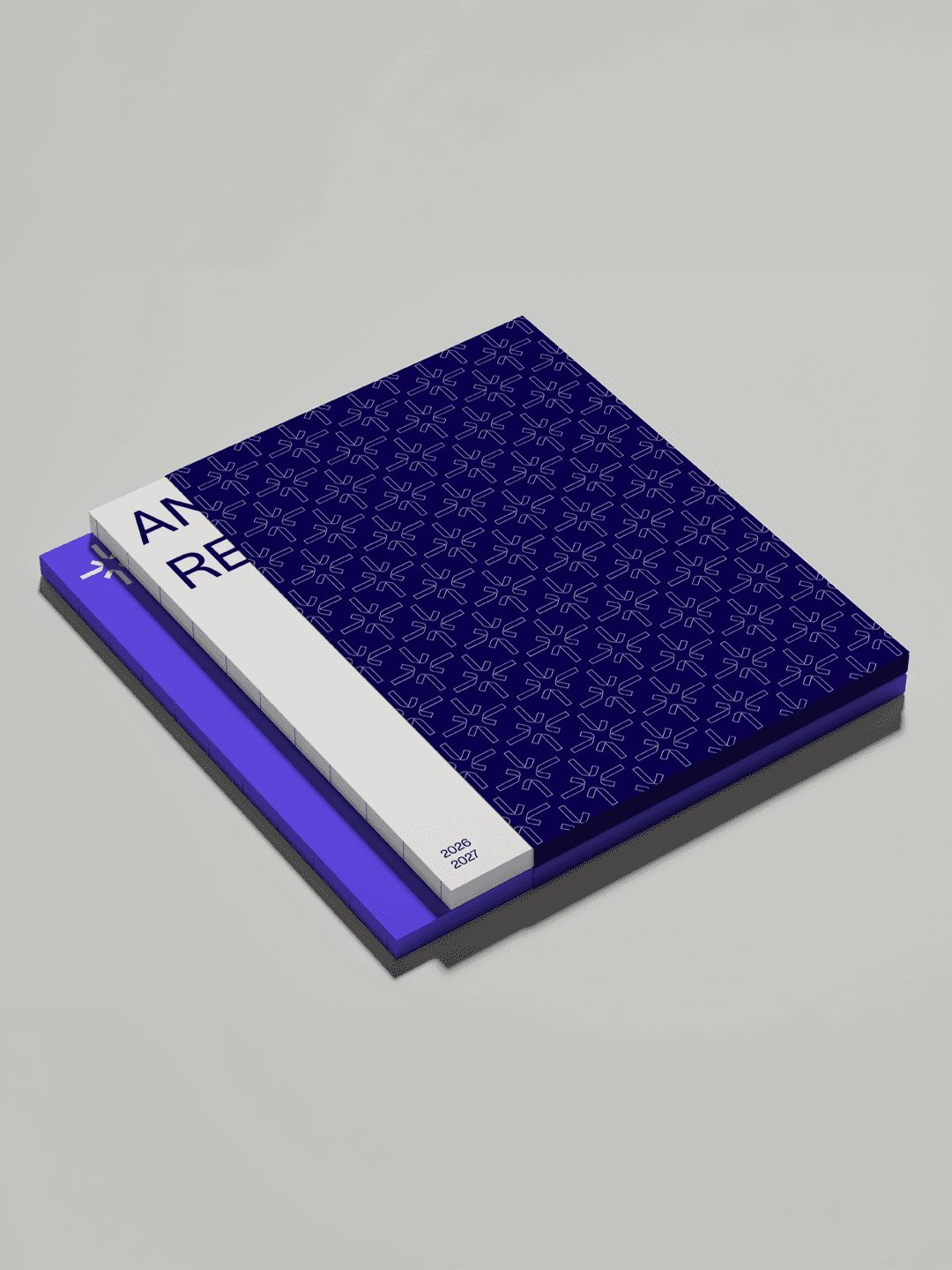
The graphic system extends the logomark itself into a primary visual element. An oversized gradient-stroke version of the four-arrow shape (with construction documented down to the Illustrator-level steps) becomes the brand's signature background treatment, and an outlined repeating pattern provides a quieter alternative for stationery and digital backgrounds. Photography direction was set toward abstract sculptural imagery (folded textures, fluid forms, light interplay), with a clear rule that photos sit inside the expanded logomark shape rather than being cropped to it. All of this was documented in a lean brand guidelines book organised so a new hire who has never seen the brand can produce a correct asset on day one.
OUR PROCESS
Started from the existing logomark and the strategic idea behind it
Designed the system outward: logo rules, typography, color, iconography, graphic vocabulary
Kept the guidelines lean enough to be read and used, not just filed
Documented everything down to the level a new hire could produce a correct asset on day one
OUR TOOLS
Visual Identity
Logo Design
Typography
Colour Palette
Iconography
Graphic System
Photography Direction
Brand Guidelines & Toolkits


Equip the team to run on its own
The Challenge
A guidelines book that lives in a folder is not a brand. 4Minds was producing branded materials continuously, and the system had to translate immediately into the formats the team actually used. The handover also had to address work that had already been produced, so that the in-house designer was set up to bring earlier outputs into alignment rather than starting over.
What we did
We built a compact set of operational templates: a PowerPoint master with six base layouts (title, section divider, text/image mix, chart, simple table, closing) plus designed live slide layouts for the team's recurring needs, a Word template with cover and body text styles, and a LinkedIn banner. We reviewed the work the in-house team had produced and shared topline recommendations for refinement against the new guidelines. The engagement closed with a two-hour handover session with the internal designer, walking through the rules, the templates, and the rationale behind the decisions, so the system would be carried forward by the people using it day to day.
OUR PROCESS
Audited the formats the team actually used day to day
Built operational templates around those recurring needs
Reviewed work already produced so the designer could align
Closed with a two-hour handover so the system lives with the people using it
OUR TOOLS
Brand Applications
Collateral & Stationery
Stakeholder Handover Decks
Implementation Handbooks
Training


Hungry for more insights?
Subscribe to our to stay up to date with industry standards.
Let’s talk
Ready to build something remarkable? We partner with ambitious teams who are serious about growth.
Contact Us
© 2026 Vicine
4MINDS AI
A brand foundation for intelligent convergence
INDUSTRY
AI Infrastructure
STAGE
Pre-Launch
SERVICES
Brand Audit • Brand Identity • Iconography • Graphic System • Brand Guidelines & Toolkits • Templates • Handover
OBJECTIVES
4Minds is building genuinely novel AI infrastructure: self-improving private models that learn continuously during inference, paired with a proprietary knowledge graph for deeper reasoning. The product team had been moving fast and the brand had been moving with it, in pieces.
There was foundational strategic work in place, a name, a clean but generic logotype, and a growing amount of materials produced in-house. What was missing was a clear system that could be leveraged to build upon the brand consistently. The team was making case-by-case decisions every time something new needed to ship.
OBJECTIVES
Over a six-week sprint, we audited what existed, separated the parts that were load-bearing from the parts that needed work, and produced a lean but rigorous set of brand guidelines covering logo (redesigned to add a meaningful logomark), typography, colour, iconography, graphic system, and photography direction.
Alongside the guidelines, we built a compact toolkit of operational templates (a PowerPoint master with designed live layouts, a Word template, a LinkedIn banner) and reviewed the work the in-house designer had produced to date with topline feedback for alignment. The engagement closed with a two-hour handover session with the internal team.
SUMMARY OF OUTCOME
4Minds came out of the sprint with a foundational ruleset that gives the team structure across essential brand elements without locking them into a heavy system they would outgrow.
The visual language now has a clear identity, an upgraded logo lockup now including a conceptually strong logomark with a documented gradient-stroke graphic treatment, a layered colour system anchored by cosmic blues, and a single-typeface system built on Acid Grotesk.
The team can now produce on-brand work without needing the studio in the loop, which is the actual point of a brand guidelines sprint.
Decide what was sacred and what could move
The Challenge
A brand built piece by piece collects momentum in some places and inconsistency in others. The first job before designing anything was to figure out which elements were load-bearing (and shouldn't be touched), which were close enough to keep with light tweaks, and which were missing entirely. Without that separation, every refinement risks either disrupting something the team had emotional ownership over, or papering over gaps that needed real attention.
What we did
We started with a structured assessment of the existing brand assets against the foundational strategic work the team had already done. We ran a one-hour collaborative session with the 4Minds team to clarify brand "sacredness" and alignment, surfacing what was non-negotiable and what was open. From there, we made light tweaks to assets that were close to working and outlined the gaps that the rest of the sprint would fill. This was a working brief and it set the pace for the next five weeks.
OUR PROCESS
Audited existing brand assets against the foundational strategic work already in place
Ran a collaborative session to surface what was non-negotiable and what was open
Separated the load-bearing elements from the gaps that needed real attention
Used that separation as the working brief for the rest of the sprint
OUR TOOLS
Brand Audit
Stakeholder Workshops
Scope Definition
Stakeholder Alignment
Build the system around what already worked
The Challenge
The four-arrow logomark and the strategic idea behind it (intelligent convergence) were our starting point for the identity. The brand needed a system around them: rules for the logo at every scale, a typographic foundation, a colour palette with documented behaviour, an iconography approach, and a graphic vocabulary the team could reach for. The constraint was scope. This was a sprint, not a deep-dive system, so the guidelines had to be lean enough to be read and used, but rigorous enough to actually hold the brand together.
What we did
We crafted a new logo and documented its lockup, clear-space, positioning rules, and the full set of approved colour treatments across primary and secondary palettes. We set Acid Grotesk as the primary typeface for its tall x-height and broad weight range, with Schibsted Grotesk and Verdana defined as Google and system fallbacks so the brand stays consistent in environments where the primary licence cannot load.
The colour system runs on three primary cosmic blues anchored by a deep navy named Cosmic, four secondary accents (Indigo, Lime, Rose, Ignite) for flexibility without losing coherence, a Plum secondary background for institutional or editorial layouts, and two gradients (Sunset and Radiant) for moments that need depth. We defined a two-mode iconography system with a monochromatic small-scale version for inline use next to text, and a two-colour graphic-scale version (Indigo with Ignite on light backgrounds, Bright Snow with Lime on dark) for slides and feature highlights, drawing on the Google Material Library as a base and adding ten custom alternates for cases where the standard library fell short.
The graphic system extends the logomark itself into a primary visual element. An oversized gradient-stroke version of the four-arrow shape (with construction documented down to the Illustrator-level steps) becomes the brand's signature background treatment, and an outlined repeating pattern provides a quieter alternative for stationery and digital backgrounds. Photography direction was set toward abstract sculptural imagery (folded textures, fluid forms, light interplay), with a clear rule that photos sit inside the expanded logomark shape rather than being cropped to it. All of this was documented in a lean brand guidelines book organised so a new hire who has never seen the brand can produce a correct asset on day one.
OUR PROCESS
Started from the existing logomark and the strategic idea behind it
Designed the system outward: logo rules, typography, color, iconography, graphic vocabulary
Kept the guidelines lean enough to be read and used, not just filed
Documented everything down to the level a new hire could produce a correct asset on day one
OUR TOOLS
Visual Identity
Logo Design
Typography
Colour Palette
Iconography
Graphic System
Photography Direction
Brand Guidelines & Toolkits
Equip the team to run on its own
The Challenge
A guidelines book that lives in a folder is not a brand. 4Minds was producing branded materials continuously, and the system had to translate immediately into the formats the team actually used. The handover also had to address work that had already been produced, so that the in-house designer was set up to bring earlier outputs into alignment rather than starting over.
What we did
We built a compact set of operational templates: a PowerPoint master with six base layouts (title, section divider, text/image mix, chart, simple table, closing) plus designed live slide layouts for the team's recurring needs, a Word template with cover and body text styles, and a LinkedIn banner. We reviewed the work the in-house team had produced and shared topline recommendations for refinement against the new guidelines. The engagement closed with a two-hour handover session with the internal designer, walking through the rules, the templates, and the rationale behind the decisions, so the system would be carried forward by the people using it day to day.
OUR PROCESS
Audited the formats the team actually used day to day
Built operational templates around those recurring needs
Reviewed work already produced so the designer could align
Closed with a two-hour handover so the system lives with the people using it
OUR TOOLS
Brand Applications
Collateral & Stationery
Stakeholder Handover Decks
Implementation Handbooks
Training


Hungry for more insights?
Subscribe to our to stay up to date with industry standards.
Let’s talk
Ready to build something remarkable? We partner with ambitious teams who are serious about growth.
Contact Us
© 2026 Vicine
4MINDS AI
A brand foundation for intelligent convergence
Industry
AI Infrastructure
Stage
Pre-Launch
Services
Brand Audit • Brand Identity • Iconography • Graphic System • Brand Guidelines & Toolkits • Templates • Handover
CONTEXT
4Minds is building genuinely novel AI infrastructure: self-improving private models that learn continuously during inference, paired with a proprietary knowledge graph for deeper reasoning. The product team had been moving fast and the brand had been moving with it, in pieces.
There was foundational strategic work in place, a name, a clean but generic logotype, and a growing amount of materials produced in-house. What was missing was a clear system that could be leveraged to build upon the brand consistently. The team was making case-by-case decisions every time something new needed to ship.
THE WORK
Over a six-week sprint, we audited what existed, separated the parts that were load-bearing from the parts that needed work, and produced a lean but rigorous set of brand guidelines covering logo (redesigned to add a meaningful logomark), typography, colour, iconography, graphic system, and photography direction.
Alongside the guidelines, we built a compact toolkit of operational templates (a PowerPoint master with designed live layouts, a Word template, a LinkedIn banner) and reviewed the work the in-house designer had produced to date with topline feedback for alignment. The engagement closed with a two-hour handover session with the internal team.
OUTCOME
4Minds came out of the sprint with a foundational ruleset that gives the team structure across essential brand elements without locking them into a heavy system they would outgrow.
The visual language now has a clear identity, an upgraded logo lockup now including a conceptually strong logomark with a documented gradient-stroke graphic treatment, a layered colour system anchored by cosmic blues, and a single-typeface system built on Acid Grotesk.
The team can now produce on-brand work without needing the studio in the loop, which is the actual point of a brand guidelines sprint.
Decide what was sacred and what could move
The Challenge
A brand built piece by piece collects momentum in some places and inconsistency in others. The first job before designing anything was to figure out which elements were load-bearing (and shouldn't be touched), which were close enough to keep with light tweaks, and which were missing entirely. Without that separation, every refinement risks either disrupting something the team had emotional ownership over, or papering over gaps that needed real attention.
What we did
We started with a structured assessment of the existing brand assets against the foundational strategic work the team had already done. We ran a one-hour collaborative session with the 4Minds team to clarify brand "sacredness" and alignment, surfacing what was non-negotiable and what was open. From there, we made light tweaks to assets that were close to working and outlined the gaps that the rest of the sprint would fill. This was a working brief and it set the pace for the next five weeks.
OUR PROCESS
Audited existing brand assets against the foundational strategic work already in place
Ran a collaborative session to surface what was non-negotiable and what was open
Separated the load-bearing elements from the gaps that needed real attention
Used that separation as the working brief for the rest of the sprint
OUR TOOLS
Brand Audit
Stakeholder Workshops
Scope Definition
Stakeholder Alignment
Build the system around what already worked
The Challenge
The four-arrow logomark and the strategic idea behind it (intelligent convergence) were our starting point for the identity. The brand needed a system around them: rules for the logo at every scale, a typographic foundation, a colour palette with documented behaviour, an iconography approach, and a graphic vocabulary the team could reach for. The constraint was scope. This was a sprint, not a deep-dive system, so the guidelines had to be lean enough to be read and used, but rigorous enough to actually hold the brand together.
What we did
We crafted a new logo and documented its lockup, clear-space, positioning rules, and the full set of approved colour treatments across primary and secondary palettes. We set Acid Grotesk as the primary typeface for its tall x-height and broad weight range, with Schibsted Grotesk and Verdana defined as Google and system fallbacks so the brand stays consistent in environments where the primary licence cannot load.
The colour system runs on three primary cosmic blues anchored by a deep navy named Cosmic, four secondary accents (Indigo, Lime, Rose, Ignite) for flexibility without losing coherence, a Plum secondary background for institutional or editorial layouts, and two gradients (Sunset and Radiant) for moments that need depth. We defined a two-mode iconography system with a monochromatic small-scale version for inline use next to text, and a two-colour graphic-scale version (Indigo with Ignite on light backgrounds, Bright Snow with Lime on dark) for slides and feature highlights, drawing on the Google Material Library as a base and adding ten custom alternates for cases where the standard library fell short.
The graphic system extends the logomark itself into a primary visual element. An oversized gradient-stroke version of the four-arrow shape (with construction documented down to the Illustrator-level steps) becomes the brand's signature background treatment, and an outlined repeating pattern provides a quieter alternative for stationery and digital backgrounds. Photography direction was set toward abstract sculptural imagery (folded textures, fluid forms, light interplay), with a clear rule that photos sit inside the expanded logomark shape rather than being cropped to it. All of this was documented in a lean brand guidelines book organised so a new hire who has never seen the brand can produce a correct asset on day one.
OUR PROCESS
Started from the existing logomark and the strategic idea behind it
Designed the system outward: logo rules, typography, color, iconography, graphic vocabulary
Kept the guidelines lean enough to be read and used, not just filed
Documented everything down to the level a new hire could produce a correct asset on day one
OUR TOOLS
Visual Identity
Logo Design
Typography
Colour Palette
Iconography
Graphic System
Photography Direction
Brand Guidelines & Toolkits
Equip the team to run on its own
The Challenge
A guidelines book that lives in a folder is not a brand. 4Minds was producing branded materials continuously, and the system had to translate immediately into the formats the team actually used. The handover also had to address work that had already been produced, so that the in-house designer was set up to bring earlier outputs into alignment rather than starting over.
What we did
We built a compact set of operational templates: a PowerPoint master with six base layouts (title, section divider, text/image mix, chart, simple table, closing) plus designed live slide layouts for the team's recurring needs, a Word template with cover and body text styles, and a LinkedIn banner. We reviewed the work the in-house team had produced and shared topline recommendations for refinement against the new guidelines. The engagement closed with a two-hour handover session with the internal designer, walking through the rules, the templates, and the rationale behind the decisions, so the system would be carried forward by the people using it day to day.
OUR PROCESS
Audited the formats the team actually used day to day
Built operational templates around those recurring needs
Reviewed work already produced so the designer could align
Closed with a two-hour handover so the system lives with the people using it
OUR TOOLS
Brand Applications
Collateral & Stationery
Stakeholder Handover Decks
Implementation Handbooks
Training
Hungry for more insights?
Subscribe to our to stay up to date with industry standards.
Let’s talk
Ready to build something remarkable? We partner with ambitious teams who are serious about growth.
Contact Us
© 2026 Vicine