
VERLINVEST
An investment site that looks like its portfolio
Industry
Investment, Consumer Brands
Stage
Established Firm
Services
UX Strategy • UI & Interaction Design • Headless Web Development
context
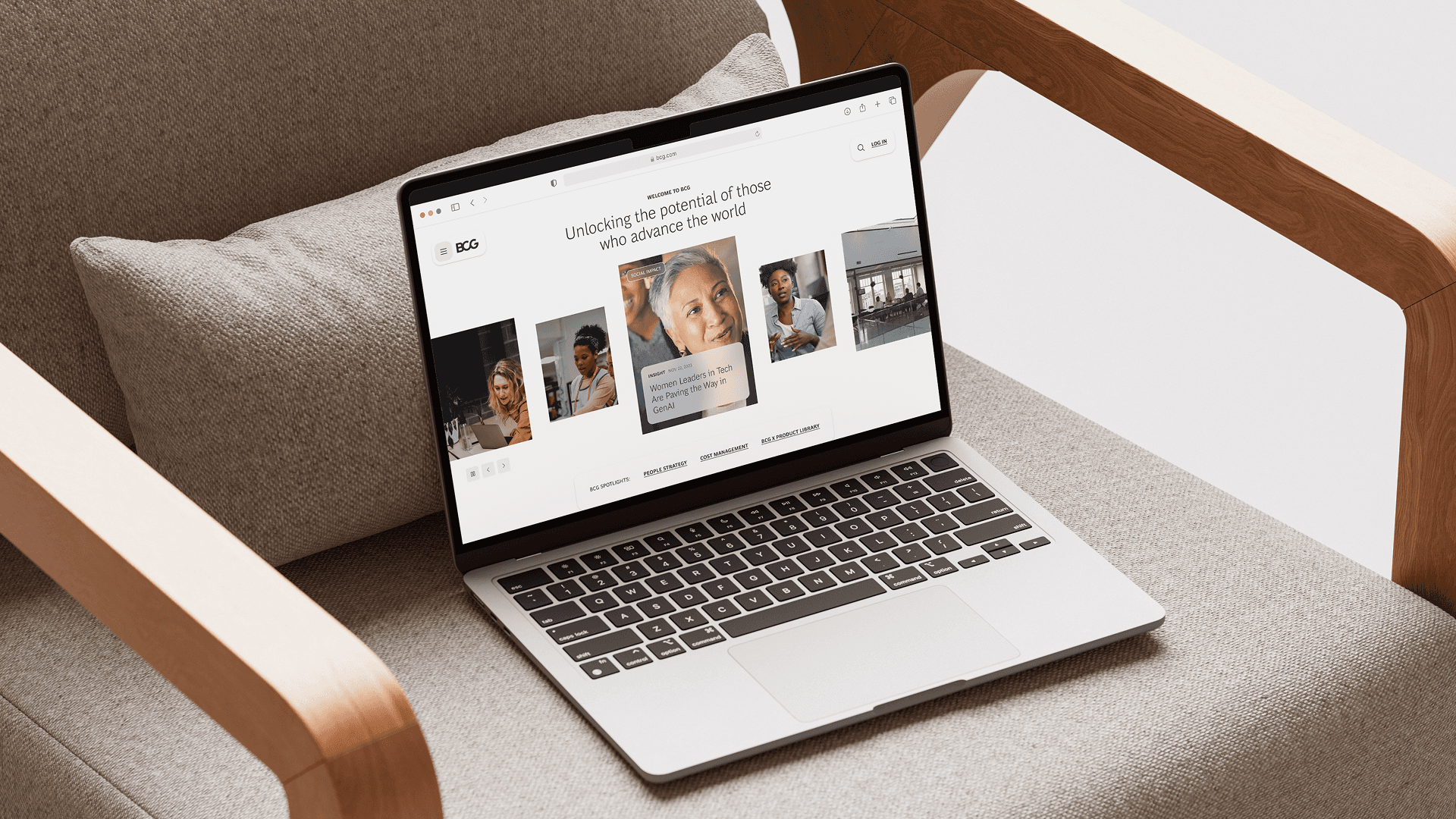
Verlinvest is a family-backed investment firm whose portfolio includes some of the most distinctive consumer brands of the last decade, among them Oatly and Vita Coco. The challenge was not the firm. It was the site. For an audience of D2C founders evaluating who to take capital from, the previous site looked and read more like a traditional financial institution than the long-hold, partner-style capital Verlinvest actually is. The mismatch was costing them with the people they most wanted to talk to.
the work
We led the redesign end to end. The work began with a strategy session to define brand personality, target audiences, and the specific role the site needed to play. From there we built user stories and journeys around the founder evaluation process, designed a visual and interaction system that holds its own next to the portfolio brands themselves, and developed the site using a headless approach with WordPress and Node.js so the team could keep it current without compromising the front-end experience.
outcome
The site launched at the end of 2022. The Verlinvest team responded strongly to it, and the relationship continued from there as an ongoing retainer with the studio, plus a follow-up engagement designing materials for the team retreat that summer. Quantitative performance data is not included in this case study.
Reframe how an investment firm presents itself
The Challenge
Investment firms tend to default to a category aesthetic: corporate photography, conservative typography, navy palettes, language that emphasizes scale and stability. Verlinvest sits outside that posture. The brands they back are confident, design-led, and explicitly non-corporate. The previous site had inherited the category conventions, and the result was a presence that read as adjacent to what they were rather than aligned with it.
What we did
We ran a strategy session with the client to articulate brand personality, target audiences, and the role of the site, then audited the existing site against that articulation. From there we built a visual system that translates Verlinvest's positioning into something closer in spirit to the brands in their portfolio, with the goal that a D2C founder landing on the site would feel they were on a peer's site, not a financial institution's.
OUR PROCESS
Ran a strategy session to articulate brand personality, target audiences, and the role of the site
Audited the existing site against that articulation to find where the mismatch lived
Defined a visual direction closer in spirit to the portfolio brands than the category defaults
Built a design system the firm's ideal audience would recognize as belonging to their world
OUR TOOLS
Stakeholder Interviews
Kickoff Workshops
Define Success Criteria
UX Audit
Brand audit
UX Strategy
Brand Positioning
Brand Personality & Archetypes
Visual Territories
Art Direction
Mood Boards


Design around the D2C founder's evaluation journey
The Challenge
A founder considering a capital partner is doing a specific kind of evaluation. They want to know who else the firm has backed and how those founders talk about working with them. They want a sense of how the firm thinks about brand and category. They want to understand whether the capital comes with the kind of support they actually need. A standard Home / About / Portfolio / Contact architecture answers none of those questions directly. The site needed to be designed against the real evaluation, not the org chart.
What we did
We wrote user stories and designed user journeys around the founder evaluation process specifically, then translated those into the information architecture and content structure of the site. The portfolio stopped functioning as a logo wall and started doing the work of showing what Verlinvest does for the companies it backs. We gave the partnership model, which in practice is the firm's main differentiator, structural presence on the site rather than burying it inside About copy.
OUR PROCESS
Wrote user stories specifically around how a founder evaluates a capital partner
Mapped those journeys into the information architecture and content structure
Redesigned the portfolio to show what Verlinvest does for companies, not just which ones
Gave the partnership model its own structural presence rather than folding it into About
OUR TOOLS
Personas
User Journeys
Jobs To Be Done
Wireframing
Rapid Prototyping
UX Design
UI Design
Interaction Design
Responsive Web Design


Build a site the team could keep alive
The Challenge
Investment firms publish: news, fund updates, portfolio additions, point-of-view pieces. A redesigned site the team could not easily update would be the same problem with a fresh coat of paint. The build had to give the Verlinvest team a familiar editorial workflow without constraining the front-end experience the design called for.
What we did
We developed the site using a headless approach. WordPress sits underneath as the content backbone for the team's editorial workflow, paired with a Node.js front end for the interaction and motion behavior the design called for. The team can keep the site current without going back to the studio for routine updates, and the front end is not limited to what a typical theme can do. We tested the transitions and layout behavior against the design intent until the live build matched the brief.
OUR PROCESS
Chose a headless approach to decouple editorial workflow from front-end behavior
Built on WordPress so the team had a familiar content management experience
Developed the Node.js front end to support the motion and interaction the design required
Tested transitions and layout behavior against the design intent until the live build matched
OUR TOOLS
Frontend Development
BACKend Development
CMS Implementation
WordPress Development
Interaction Design
UI GUIDELINES
Motion & Animations
After launch
The site launched at the end of 2022. The relationship has continued since: an ongoing retainer with the studio for design and development support, and a follow-up engagement that summer designing the materials for the Verlinvest team retreat.


Hungry for more insights?
Subscribe to our to stay up to date with industry standards.
Let’s talk
Ready to build something remarkable? We partner with ambitious teams who are serious about growth.
Contact Us
© 2026 Vicine
VERLINVEST
An investment site that looks like its portfolio
Industry
Investment, Consumer Brands
Stage
Established Firm
Services
UX Strategy • UI & Interaction Design • Headless Web Development
context
Verlinvest is a family-backed investment firm whose portfolio includes some of the most distinctive consumer brands of the last decade, among them Oatly and Vita Coco. The challenge was not the firm. It was the site. For an audience of D2C founders evaluating who to take capital from, the previous site looked and read more like a traditional financial institution than the long-hold, partner-style capital Verlinvest actually is. The mismatch was costing them with the people they most wanted to talk to.
the work
We led the redesign end to end. The work began with a strategy session to define brand personality, target audiences, and the specific role the site needed to play. From there we built user stories and journeys around the founder evaluation process, designed a visual and interaction system that holds its own next to the portfolio brands themselves, and developed the site using a headless approach with WordPress and Node.js so the team could keep it current without compromising the front-end experience.
outcome
The site launched at the end of 2022. The Verlinvest team responded strongly to it, and the relationship continued from there as an ongoing retainer with the studio, plus a follow-up engagement designing materials for the team retreat that summer. Quantitative performance data is not included in this case study.
Reframe how an investment firm presents itself
The Challenge
Investment firms tend to default to a category aesthetic: corporate photography, conservative typography, navy palettes, language that emphasizes scale and stability. Verlinvest sits outside that posture. The brands they back are confident, design-led, and explicitly non-corporate. The previous site had inherited the category conventions, and the result was a presence that read as adjacent to what they were rather than aligned with it.
What we did
We ran a strategy session with the client to articulate brand personality, target audiences, and the role of the site, then audited the existing site against that articulation. From there we built a visual system that translates Verlinvest's positioning into something closer in spirit to the brands in their portfolio, with the goal that a D2C founder landing on the site would feel they were on a peer's site, not a financial institution's.
OUR PROCESS
Ran a strategy session to articulate brand personality, target audiences, and the role of the site
Audited the existing site against that articulation to find where the mismatch lived
Defined a visual direction closer in spirit to the portfolio brands than the category defaults
Built a design system the firm's ideal audience would recognize as belonging to their world
OUR TOOLS
Stakeholder Interviews
Kickoff Workshops
Define Success Criteria
UX Audit
Brand audit
UX Strategy
Brand Positioning
Brand Personality & Archetypes
Visual Territories
Art Direction
Mood Boards
Design around the D2C founder's evaluation journey
The Challenge
A founder considering a capital partner is doing a specific kind of evaluation. They want to know who else the firm has backed and how those founders talk about working with them. They want a sense of how the firm thinks about brand and category. They want to understand whether the capital comes with the kind of support they actually need. A standard Home / About / Portfolio / Contact architecture answers none of those questions directly. The site needed to be designed against the real evaluation, not the org chart.
What we did
We wrote user stories and designed user journeys around the founder evaluation process specifically, then translated those into the information architecture and content structure of the site. The portfolio stopped functioning as a logo wall and started doing the work of showing what Verlinvest does for the companies it backs. We gave the partnership model, which in practice is the firm's main differentiator, structural presence on the site rather than burying it inside About copy.
OUR PROCESS
Wrote user stories specifically around how a founder evaluates a capital partner
Mapped those journeys into the information architecture and content structure
Redesigned the portfolio to show what Verlinvest does for companies, not just which ones
Gave the partnership model its own structural presence rather than folding it into About
OUR TOOLS
Personas
User Journeys
Jobs To Be Done
Wireframing
Rapid Prototyping
UX Design
UI Design
Interaction Design
Responsive Web Design
Build a site the team could keep alive
The Challenge
Investment firms publish: news, fund updates, portfolio additions, point-of-view pieces. A redesigned site the team could not easily update would be the same problem with a fresh coat of paint. The build had to give the Verlinvest team a familiar editorial workflow without constraining the front-end experience the design called for.
What we did
We developed the site using a headless approach. WordPress sits underneath as the content backbone for the team's editorial workflow, paired with a Node.js front end for the interaction and motion behavior the design called for. The team can keep the site current without going back to the studio for routine updates, and the front end is not limited to what a typical theme can do. We tested the transitions and layout behavior against the design intent until the live build matched the brief.
OUR PROCESS
Chose a headless approach to decouple editorial workflow from front-end behavior
Built on WordPress so the team had a familiar content management experience
Developed the Node.js front end to support the motion and interaction the design required
Tested transitions and layout behavior against the design intent until the live build matched
OUR TOOLS
Frontend Development
BACKend Development
CMS Implementation
WordPress Development
Interaction Design
UI GUIDELINES
Motion & Animations
After launch
The site launched at the end of 2022. The relationship has continued since: an ongoing retainer with the studio for design and development support, and a follow-up engagement that summer designing the materials for the Verlinvest team retreat.
Hungry for more insights?
Subscribe to our to stay up to date with industry standards.
Let’s talk
Ready to build something remarkable? We partner with ambitious teams who are serious about growth.
Contact Us
© 2026 Vicine
VERLINVEST
An investment site that looks like its portfolio
INDUSTRY
Investment, Consumer Brands
STAGE
Established Firm
SERVICES
UX Strategy • UI & Interaction Design • Headless Web Development
OBJECTIVES
Verlinvest is a family-backed investment firm whose portfolio includes some of the most distinctive consumer brands of the last decade, among them Oatly and Vita Coco. The challenge was not the firm. It was the site. For an audience of D2C founders evaluating who to take capital from, the previous site looked and read more like a traditional financial institution than the long-hold, partner-style capital Verlinvest actually is. The mismatch was costing them with the people they most wanted to talk to.
OBJECTIVES
We led the redesign end to end. The work began with a strategy session to define brand personality, target audiences, and the specific role the site needed to play. From there we built user stories and journeys around the founder evaluation process, designed a visual and interaction system that holds its own next to the portfolio brands themselves, and developed the site using a headless approach with WordPress and Node.js so the team could keep it current without compromising the front-end experience.
OBJECTIVES
The site launched at the end of 2022. The Verlinvest team responded strongly to it, and the relationship continued from there as an ongoing retainer with the studio, plus a follow-up engagement designing materials for the team retreat that summer. Quantitative performance data is not included in this case study.
Reframe how an investment firm presents itself
The Challenge
Investment firms tend to default to a category aesthetic: corporate photography, conservative typography, navy palettes, language that emphasizes scale and stability. Verlinvest sits outside that posture. The brands they back are confident, design-led, and explicitly non-corporate. The previous site had inherited the category conventions, and the result was a presence that read as adjacent to what they were rather than aligned with it.
What we did
We ran a strategy session with the client to articulate brand personality, target audiences, and the role of the site, then audited the existing site against that articulation. From there we built a visual system that translates Verlinvest's positioning into something closer in spirit to the brands in their portfolio, with the goal that a D2C founder landing on the site would feel they were on a peer's site, not a financial institution's.
OUR PROCESS
Ran a strategy session to articulate brand personality, target audiences, and the role of the site
Audited the existing site against that articulation to find where the mismatch lived
Defined a visual direction closer in spirit to the portfolio brands than the category defaults
Built a design system the firm's ideal audience would recognize as belonging to their world
OUR TOOLS
Stakeholder Interviews
Kickoff Workshops
Define Success Criteria
UX Audit
Brand audit
UX Strategy
Brand Positioning
Brand Personality & Archetypes
Visual Territories
Art Direction
Mood Boards
Design around the D2C founder's evaluation journey
The Challenge
A founder considering a capital partner is doing a specific kind of evaluation. They want to know who else the firm has backed and how those founders talk about working with them. They want a sense of how the firm thinks about brand and category. They want to understand whether the capital comes with the kind of support they actually need. A standard Home / About / Portfolio / Contact architecture answers none of those questions directly. The site needed to be designed against the real evaluation, not the org chart.
What we did
We wrote user stories and designed user journeys around the founder evaluation process specifically, then translated those into the information architecture and content structure of the site. The portfolio stopped functioning as a logo wall and started doing the work of showing what Verlinvest does for the companies it backs. We gave the partnership model, which in practice is the firm's main differentiator, structural presence on the site rather than burying it inside About copy.
OUR PROCESS
Wrote user stories specifically around how a founder evaluates a capital partner
Mapped those journeys into the information architecture and content structure
Redesigned the portfolio to show what Verlinvest does for companies, not just which ones
Gave the partnership model its own structural presence rather than folding it into About
OUR TOOLS
Personas
User Journeys
Jobs To Be Done
Wireframing
Rapid Prototyping
UX Design
UI Design
Interaction Design
Responsive Web Design
Build a site the team could keep alive
The Challenge
Investment firms publish: news, fund updates, portfolio additions, point-of-view pieces. A redesigned site the team could not easily update would be the same problem with a fresh coat of paint. The build had to give the Verlinvest team a familiar editorial workflow without constraining the front-end experience the design called for.
What we did
We developed the site using a headless approach. WordPress sits underneath as the content backbone for the team's editorial workflow, paired with a Node.js front end for the interaction and motion behavior the design called for. The team can keep the site current without going back to the studio for routine updates, and the front end is not limited to what a typical theme can do. We tested the transitions and layout behavior against the design intent until the live build matched the brief.
OUR PROCESS
Chose a headless approach to decouple editorial workflow from front-end behavior
Built on WordPress so the team had a familiar content management experience
Developed the Node.js front end to support the motion and interaction the design required
Tested transitions and layout behavior against the design intent until the live build matched
OUR TOOLS
Frontend Development
BACKend Development
CMS Implementation
WordPress Development
Interaction Design
UI GUIDELINES
Motion & Animations
CONCLUSION
The site launched at the end of 2022. The relationship has continued since: an ongoing retainer with the studio for design and development support, and a follow-up engagement that summer designing the materials for the Verlinvest team retreat.


Hungry for more insights?
Subscribe to our to stay up to date with industry standards.
Let’s talk
Ready to build something remarkable? We partner with ambitious teams who are serious about growth.
Contact Us
© 2026 Vicine