
COUNCIL OAKS
A standalone brand for capital that thinks in generations
Industry
Investment Management
Stage
New Entity, Pre-Launch
Services
Brand Strategy • Brand Identity • Brand Applications
Context
Council Oaks Partners is a specialized asset management firm to serve large family offices and the RIAs that advise them. The brand needed to feel rustworthy, established, oriented toward excellence, built to last. Council Oaks works with families where trust is built slowly across years with the intent of lasting generations. The brand had to carry similar gravitas.
The work
Vicine led the brand from strategy through application. We worked with the founder to anchor the strategy in the firm's organizing idea: that capital, like a family name, is something stewarded across generations rather than maximized in any one. From there we designed a visual identity built around tree growth rings, a system that reads as permanent rather than novel, and extended it across the artifacts where family-office relationships actually take place: business cards, stationery, a notebook, schwag, a pre-launch landing page.
outcome
The work gave Council Oaks a distinct strategic foundation, a visual identity calibrated for the patience of family-office relationships, and a complete applied system ready for launch. The brand has been in market since late 2023. As a private firm operating in a category where discretion is the norm, performance metrics are not included in this case study.
Define a position that earns trust at a family-office pace
The Challenge
Council Oaks operates in a context where the decisionmaker may be a single person, where loyalty is built over decades rather than quarters, and where the question being asked is not whether you'll outperform but whether the family can entrust you with their children's inheritance. Discretion is non-negotiable. Council Oaks needed a position that took those dynamics seriously.
What we did
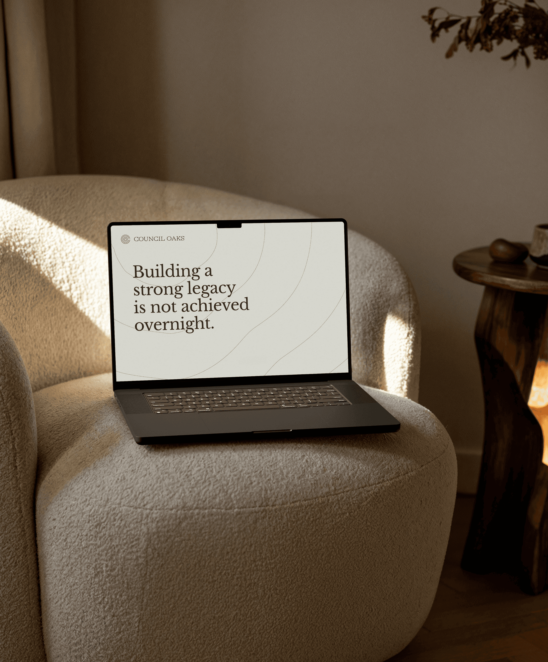
We worked through the strategy with the founder before any visual exploration. The intergenerational frame became the organizing idea, and we extended it deliberately past the obvious meaning of intergenerational capital into legacy, character, responsibility, stewardship, opportunity. The positioning ran through that frame, anchored in the asymmetry between family-office and institutional dynamics, and the messaging was written to be recognizable to family principals. The headline that came out of the work, "Building a strong legacy is not achieved overnight," carried the brand's central claim into every applied execution.
OUR PROCESS
Worked through strategy with the founder before any visual exploration began
Anchored the positioning in the asymmetry between family-office and institutional dynamics
Extended the intergenerational frame deliberately into legacy, stewardship, and responsibility
Wrote messaging recognizable to family principals, not financial institutions
OUR TOOLS
Stakeholder Interviews
Kickoff Workshops
Define Success Criteria
Brand Audit
Brand Positioning
Brand NARRATIVE
Messaging
North Star & Purpose
Brand Values
Brand Voice & Tone Of Voice


Build a visual system around endurance
The Challenge
Investment management defaults to a familiar register: navy, serif, marble photography, language of scale and stability. None of it is wrong, and most of it is interchangeable. For a firm whose actual differentiator is the willingness to think across generations rather than quarters, the system needed to feel permanent and unhurried at first glance, in a way that competitors borrowing the same conventions could not easily replicate.
What we did
We anchored the identity in the metaphor of tree growth rings. Rings record time. They radiate from a center. They form when something survives one season after another, and they hold a quiet associative link to the Council Oak trees the firm is named for. The logomark resolves into a stylized "CO" built from concentric arcs, reading as both monogram and growth pattern depending on how long you look at it. The palette runs warm and earthy: a near-black Night Green, a saturated Sage, and a family of warm sands and beiges that ground the system in something organic rather than corporate. Libre Baskerville carries the headline voice with the kind of restraint serious money expects, paired with Inter Tight in the supporting register. Growth-ring textures, in both flat-line and 3D variants, extend the system into surface and material treatments.
OUR PROCESS
Explored visual territories rooted in the firm's name and organizing idea before committing to a direction
Anchored the identity in tree growth rings as a metaphor for permanence, patience, and time
Built a palette and type system that felt organic and serious without borrowing the category defaults
Documented the system so it could extend into surface and material treatments consistently
OUR TOOLS
Visual Territories
Visual Concepts
Art Direction
Mood Boards
Visual Identity
Logo Design
Colour Palette
Iconography
Typography
Photography Direction


Apply the brand to the artifacts where family-office relationships happen
The Challenge
Family-office relationships do not run through the touchpoints most brands build for. The work happens in private contexts: a folder slid across a table, a letter on the firm's stationery, a notebook left after a meeting, the landing page someone pulls up on a phone after a referral. Each artifact is small. The cumulative impression is the brand. The system had to hold the strategy at the scale of a business card and at the scale of a pre-launch web presence, with consistency that read as deliberate rather than templated.
What we did
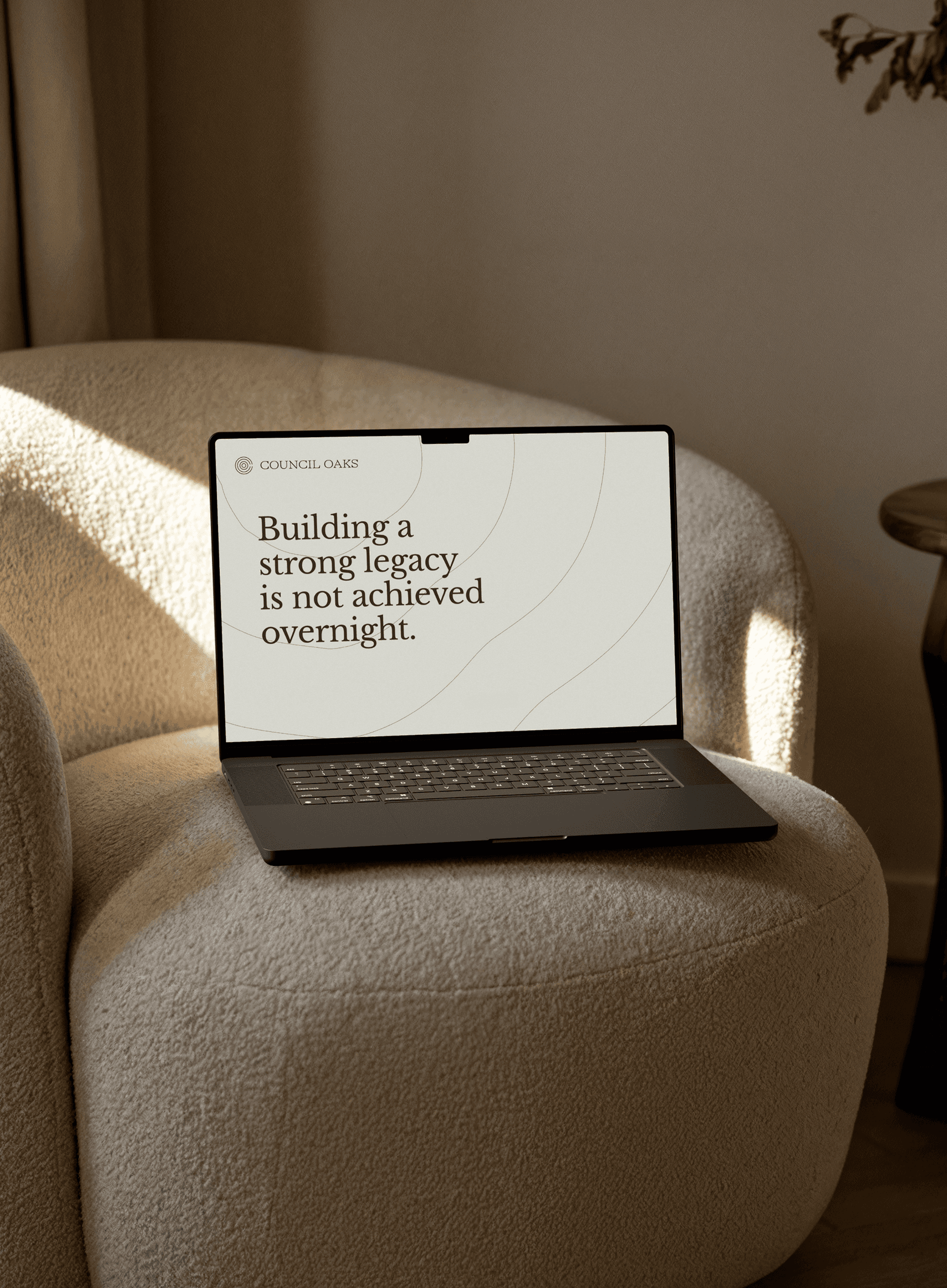
We extended the system across the full applied package. Business cards on heavy stock, with the monogram quietly embossed. Letterheads, envelopes, and folders in dark Night Green with subtle growth-ring detailing pressed into the surface. A pre-launch landing page leading with the legacy headline against a layered ring backdrop, set on a warm Sand canvas. Notebooks and schwag designed to feel like objects worth keeping rather than promotional handouts. Photography direction kept the system grounded with no frills and no saturation: tree rings, bamboo, root structures, holding the same restraint as the type system. The complete package was handed over with a topline brand guidelines document so the team could carry the system forward without going back to the studio for routine applications.
OUR PROCESS
Mapped the actual contexts where the brand would show up before designing any application
Extended the system across stationery, collateral, and schwag designed to feel worth keeping
Designed a pre-launch landing page that carried the brand's central claim at full scale
Closed with a topline brand guidelines handover so the team could run without the studio
OUR TOOLS
Brand Guidelines & Toolkits
Collateral & Stationery
High-Craft Assets
3D
UI Design
Responsive Web Design
Art Direction
Copywriting
Stakeholder Handover Decks


Hungry for more insights?
Subscribe to our to stay up to date with industry standards.
Let’s talk
Ready to build something remarkable? We partner with ambitious teams who are serious about growth.
Contact Us
© 2026 Vicine
COUNCIL OAKS
A standalone brand for capital that thinks in generations
INDUSTRY
Investment Management
STAGE
New Entity, Pre-Launch
SERVICES
Brand Strategy • Brand Identity • Brand Applications
OBJECTIVES
Council Oaks Partners is a specialized asset management firm to serve large family offices and the RIAs that advise them. The brand needed to feel rustworthy, established, oriented toward excellence, built to last. Council Oaks works with families where trust is built slowly across years with the intent of lasting generations. The brand had to carry similar gravitas.
OBJECTIVES
Vicine led the brand from strategy through application. We worked with the founder to anchor the strategy in the firm's organizing idea: that capital, like a family name, is something stewarded across generations rather than maximized in any one. From there we designed a visual identity built around tree growth rings, a system that reads as permanent rather than novel, and extended it across the artifacts where family-office relationships actually take place: business cards, stationery, a notebook, schwag, a pre-launch landing page.
OBJECTIVES
The work gave Council Oaks a distinct strategic foundation, a visual identity calibrated for the patience of family-office relationships, and a complete applied system ready for launch. The brand has been in market since late 2023. As a private firm operating in a category where discretion is the norm, performance metrics are not included in this case study.
Define a position that earns trust at a family-office pace
The Challenge
Council Oaks operates in a context where the decisionmaker may be a single person, where loyalty is built over decades rather than quarters, and where the question being asked is not whether you'll outperform but whether the family can entrust you with their children's inheritance. Discretion is non-negotiable. Council Oaks needed a position that took those dynamics seriously.
What we did
We worked through the strategy with the founder before any visual exploration. The intergenerational frame became the organizing idea, and we extended it deliberately past the obvious meaning of intergenerational capital into legacy, character, responsibility, stewardship, opportunity. The positioning ran through that frame, anchored in the asymmetry between family-office and institutional dynamics, and the messaging was written to be recognizable to family principals. The headline that came out of the work, "Building a strong legacy is not achieved overnight," carried the brand's central claim into every applied execution.
OUR PROCESS
Worked through strategy with the founder before any visual exploration began
Anchored the positioning in the asymmetry between family-office and institutional dynamics
Extended the intergenerational frame deliberately into legacy, stewardship, and responsibility
Wrote messaging recognizable to family principals, not financial institutions
OUR TOOLS
Stakeholder Interviews
Kickoff Workshops
Define Success Criteria
Brand Audit
Brand Positioning
Brand NARRATIVE
Messaging
North Star & Purpose
Brand Values
Brand Voice & Tone Of Voice
Build a visual system around endurance
The Challenge
Investment management defaults to a familiar register: navy, serif, marble photography, language of scale and stability. None of it is wrong, and most of it is interchangeable. For a firm whose actual differentiator is the willingness to think across generations rather than quarters, the system needed to feel permanent and unhurried at first glance, in a way that competitors borrowing the same conventions could not easily replicate.
What we did
We anchored the identity in the metaphor of tree growth rings. Rings record time. They radiate from a center. They form when something survives one season after another, and they hold a quiet associative link to the Council Oak trees the firm is named for. The logomark resolves into a stylized "CO" built from concentric arcs, reading as both monogram and growth pattern depending on how long you look at it. The palette runs warm and earthy: a near-black Night Green, a saturated Sage, and a family of warm sands and beiges that ground the system in something organic rather than corporate. Libre Baskerville carries the headline voice with the kind of restraint serious money expects, paired with Inter Tight in the supporting register. Growth-ring textures, in both flat-line and 3D variants, extend the system into surface and material treatments.
OUR PROCESS
Explored visual territories rooted in the firm's name and organizing idea before committing to a direction
Anchored the identity in tree growth rings as a metaphor for permanence, patience, and time
Built a palette and type system that felt organic and serious without borrowing the category defaults
Documented the system so it could extend into surface and material treatments consistently
OUR TOOLS
Visual Territories
Visual Concepts
Art Direction
Mood Boards
Visual Identity
Logo Design
Colour Palette
Iconography
Typography
Photography Direction
Apply the brand to the artifacts where family-office relationships happen
The Challenge
Family-office relationships do not run through the touchpoints most brands build for. The work happens in private contexts: a folder slid across a table, a letter on the firm's stationery, a notebook left after a meeting, the landing page someone pulls up on a phone after a referral. Each artifact is small. The cumulative impression is the brand. The system had to hold the strategy at the scale of a business card and at the scale of a pre-launch web presence, with consistency that read as deliberate rather than templated.
What we did
We extended the system across the full applied package. Business cards on heavy stock, with the monogram quietly embossed. Letterheads, envelopes, and folders in dark Night Green with subtle growth-ring detailing pressed into the surface. A pre-launch landing page leading with the legacy headline against a layered ring backdrop, set on a warm Sand canvas. Notebooks and schwag designed to feel like objects worth keeping rather than promotional handouts. Photography direction kept the system grounded with no frills and no saturation: tree rings, bamboo, root structures, holding the same restraint as the type system. The complete package was handed over with a topline brand guidelines document so the team could carry the system forward without going back to the studio for routine applications.
OUR PROCESS
Mapped the actual contexts where the brand would show up before designing any application
Extended the system across stationery, collateral, and schwag designed to feel worth keeping
Designed a pre-launch landing page that carried the brand's central claim at full scale
Closed with a topline brand guidelines handover so the team could run without the studio
OUR TOOLS
Brand Guidelines & Toolkits
Collateral & Stationery
High-Craft Assets
3D
UI Design
Responsive Web Design
Art Direction
Copywriting
Stakeholder Handover Decks

Hungry for more insights?
Subscribe to our to stay up to date with industry standards.
Let’s talk
Ready to build something remarkable? We partner with ambitious teams who are serious about growth.
Contact Us
© 2026 Vicine
COUNCIL OAKS
A standalone brand for capital that thinks in generations
Industry
Investment Management
Stage
New Entity, Pre-Launch
Services
Brand Strategy • Brand Identity • Brand Applications
Context
Council Oaks Partners is a specialized asset management firm to serve large family offices and the RIAs that advise them. The brand needed to feel rustworthy, established, oriented toward excellence, built to last. Council Oaks works with families where trust is built slowly across years with the intent of lasting generations. The brand had to carry similar gravitas.
The work
Vicine led the brand from strategy through application. We worked with the founder to anchor the strategy in the firm's organizing idea: that capital, like a family name, is something stewarded across generations rather than maximized in any one. From there we designed a visual identity built around tree growth rings, a system that reads as permanent rather than novel, and extended it across the artifacts where family-office relationships actually take place: business cards, stationery, a notebook, schwag, a pre-launch landing page.
outcome
The work gave Council Oaks a distinct strategic foundation, a visual identity calibrated for the patience of family-office relationships, and a complete applied system ready for launch. The brand has been in market since late 2023. As a private firm operating in a category where discretion is the norm, performance metrics are not included in this case study.
Define a position that earns trust at a family-office pace
The Challenge
Council Oaks operates in a context where the decisionmaker may be a single person, where loyalty is built over decades rather than quarters, and where the question being asked is not whether you'll outperform but whether the family can entrust you with their children's inheritance. Discretion is non-negotiable. Council Oaks needed a position that took those dynamics seriously.
What we did
We worked through the strategy with the founder before any visual exploration. The intergenerational frame became the organizing idea, and we extended it deliberately past the obvious meaning of intergenerational capital into legacy, character, responsibility, stewardship, opportunity. The positioning ran through that frame, anchored in the asymmetry between family-office and institutional dynamics, and the messaging was written to be recognizable to family principals. The headline that came out of the work, "Building a strong legacy is not achieved overnight," carried the brand's central claim into every applied execution.
OUR PROCESS
Worked through strategy with the founder before any visual exploration began
Anchored the positioning in the asymmetry between family-office and institutional dynamics
Extended the intergenerational frame deliberately into legacy, stewardship, and responsibility
Wrote messaging recognizable to family principals, not financial institutions
OUR TOOLS
Stakeholder Interviews
Kickoff Workshops
Define Success Criteria
Brand Audit
Brand Positioning
Brand NARRATIVE
Messaging
North Star & Purpose
Brand Values
Brand Voice & Tone Of Voice
Build a visual system around endurance
The Challenge
Investment management defaults to a familiar register: navy, serif, marble photography, language of scale and stability. None of it is wrong, and most of it is interchangeable. For a firm whose actual differentiator is the willingness to think across generations rather than quarters, the system needed to feel permanent and unhurried at first glance, in a way that competitors borrowing the same conventions could not easily replicate.
What we did
We anchored the identity in the metaphor of tree growth rings. Rings record time. They radiate from a center. They form when something survives one season after another, and they hold a quiet associative link to the Council Oak trees the firm is named for. The logomark resolves into a stylized "CO" built from concentric arcs, reading as both monogram and growth pattern depending on how long you look at it. The palette runs warm and earthy: a near-black Night Green, a saturated Sage, and a family of warm sands and beiges that ground the system in something organic rather than corporate. Libre Baskerville carries the headline voice with the kind of restraint serious money expects, paired with Inter Tight in the supporting register. Growth-ring textures, in both flat-line and 3D variants, extend the system into surface and material treatments.
OUR PROCESS
Explored visual territories rooted in the firm's name and organizing idea before committing to a direction
Anchored the identity in tree growth rings as a metaphor for permanence, patience, and time
Built a palette and type system that felt organic and serious without borrowing the category defaults
Documented the system so it could extend into surface and material treatments consistently
OUR TOOLS
Visual Territories
Visual Concepts
Art Direction
Mood Boards
Visual Identity
Logo Design
Colour Palette
Iconography
Typography
Photography Direction
Apply the brand to the artifacts where family-office relationships happen
The Challenge
Family-office relationships do not run through the touchpoints most brands build for. The work happens in private contexts: a folder slid across a table, a letter on the firm's stationery, a notebook left after a meeting, the landing page someone pulls up on a phone after a referral. Each artifact is small. The cumulative impression is the brand. The system had to hold the strategy at the scale of a business card and at the scale of a pre-launch web presence, with consistency that read as deliberate rather than templated.
What we did
We extended the system across the full applied package. Business cards on heavy stock, with the monogram quietly embossed. Letterheads, envelopes, and folders in dark Night Green with subtle growth-ring detailing pressed into the surface. A pre-launch landing page leading with the legacy headline against a layered ring backdrop, set on a warm Sand canvas. Notebooks and schwag designed to feel like objects worth keeping rather than promotional handouts. Photography direction kept the system grounded with no frills and no saturation: tree rings, bamboo, root structures, holding the same restraint as the type system. The complete package was handed over with a topline brand guidelines document so the team could carry the system forward without going back to the studio for routine applications.
OUR PROCESS
Mapped the actual contexts where the brand would show up before designing any application
Extended the system across stationery, collateral, and schwag designed to feel worth keeping
Designed a pre-launch landing page that carried the brand's central claim at full scale
Closed with a topline brand guidelines handover so the team could run without the studio
OUR TOOLS
Brand Guidelines & Toolkits
Collateral & Stationery
High-Craft Assets
3D
UI Design
Responsive Web Design
Art Direction
Copywriting
Stakeholder Handover Decks
Hungry for more insights?
Subscribe to our to stay up to date with industry standards.
Let’s talk
Ready to build something remarkable? We partner with ambitious teams who are serious about growth.
Contact Us
© 2026 Vicine