
Your Health Revealed
AHEAD HEALTH
A brand for Europe's first AI-driven preventive healthcare program
Industry
Preventive Healthcare
Stage
Pre-Launch
Services
Naming • Brand Strategy • Brand Identity • UX/UI Design
Context
Ahead launched a category that barely existed in Europe: an annual, AI-supported preventive healthcare program combining whole-body MRI, extended blood panels, and continuous longitudinal monitoring. The clinical foundation was strong. The team are repeat founders and medtech experts with clinical partners across Switzerland and a credible scientific board. The brand had a harder job. It had to make proactive, paid prevention feel as natural as an annual checkup, while sitting between two reference points that both felt wrong: traditional healthcare, slow and institutional, and consumer wellness, loose with claims and light on science.
The work
We built the brand from zero across three connected workstreams. We ran a strategy process to define purpose, personality, target audiences, and messaging. We designed a complete visual identity organised around a single concept, "from blur to clarity," that turned the brand's central promise of insight into your own body into a graphic system. And we designed an initial version of the digital experience, including the homepage’s scrollytelling and the interactive screening dashboard customers receive after their annual visit.
Outcome and results
Ahead launched with a coherent identity and a working digital product, ready to onboard customers through a partner clinic network in the Zurich area. Following launch, Ahead Health closed a $6M seed round led by RTP Global to scale the model across Europe.
DEFINING WHAT AHEAD ACTUALLY STANDS FOR
The Challenge
Categories that sit between two established ones inherit the worst of both unless they take a deliberate position. Preventive healthcare in Europe is treated as either a niche concierge service for the wealthy or a vague wellness pitch dressed up with medical language. Ahead is neither. The brand needed a clear point of view with enough specificity that every later decision (visual, verbal, product) had a test to pass.
What we did
We worked through the strategic stack from the inside out. Stakeholder workshops with the founding team surfaced the company's why, how, and what, and a one-line descriptor. We also led the naming work and landed on Ahead, a single word that reads as both verb and destination, and that the eventual identity could resolve into a forward-pointing arrow.
Competitor analysis and benchmarking mapped how the category was being communicated and where the openings were. We built four target personas across the relevant age range, each with their own fears, motivations, and the specific objection that would convince them to commit to an annual program.
We wrote brand commitments and brand promises against each phase of the customer journey, then combined the inward values and outward communication into a single brand personality: a savvy partner that is present without being overbearing, expert without being clinical, a giver of good advice that never tips into judgement.
OUR PROCESS
Stakeholder workshops to surface the company's why, how, and what
Competitor analysis and benchmarking to map category openings
Four target personas built across the relevant age range
Brand commitments and promises written against each journey phase
OUR TOOLS
Benchmarking
Personas
Naming
Stakeholder Interview
Competitive Analysis
Brand Narrative
Brand positioning
Messaging
North Star & Purpose
Brand values
Brand Pillars
Brand Personality & Archetypes

BUILDING A VISUAL SYSTEM THAT EARNS THE WORD "PREVENTION"
The Challenge
Most healthcare branding looks the same: a soft blue, a clean sans-serif, a clinical photograph. Brands that try to escape this often overcorrect into wellness aesthetics that lose their clinical credibility. Ahead needed an identity that read as scientifically serious and quietly modern at the same time, distinct enough not to get filed next to either reference category.
What we did
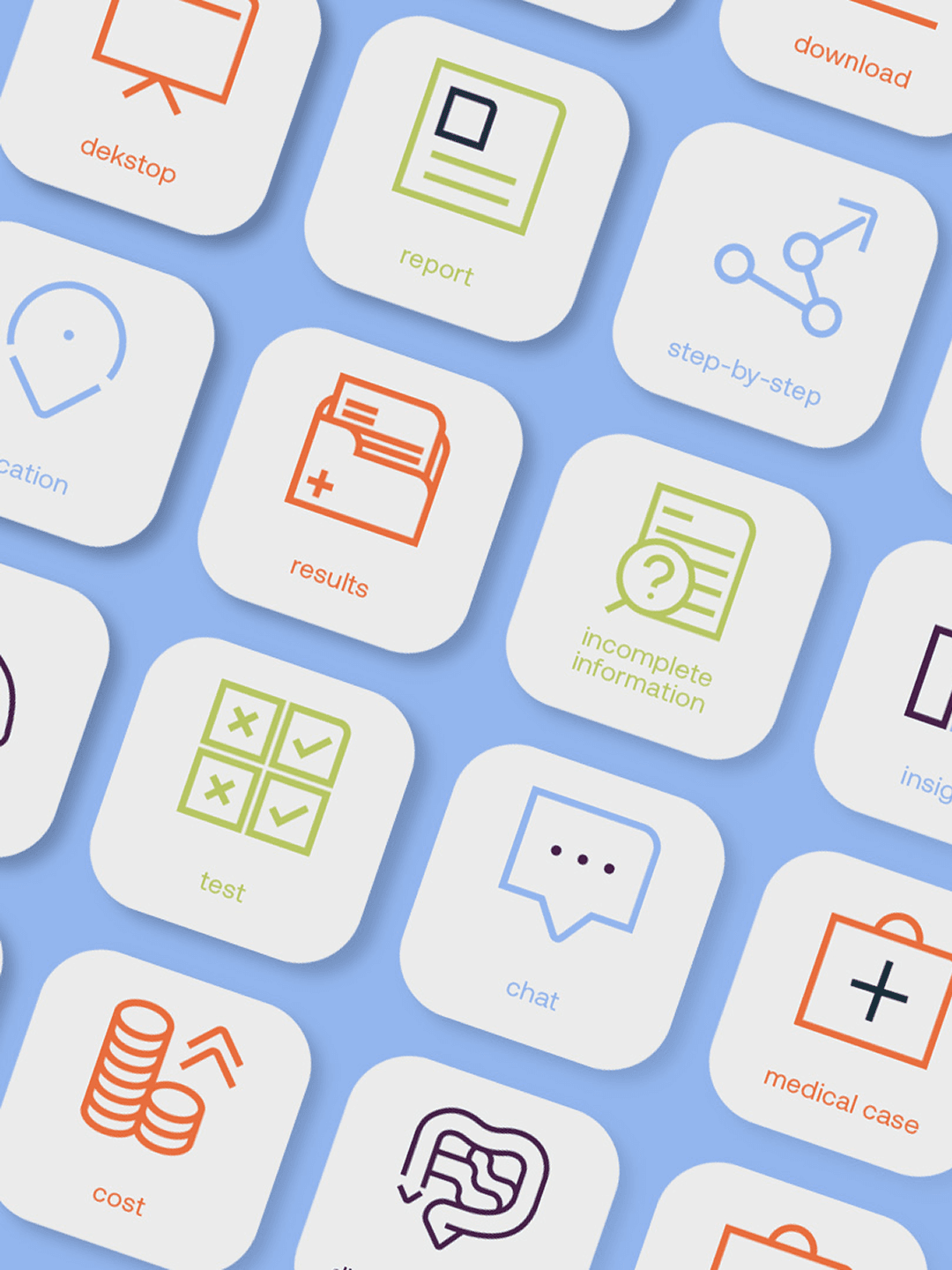
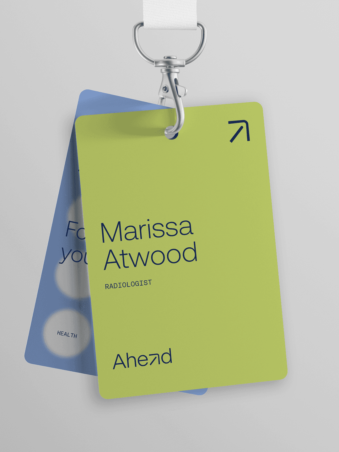
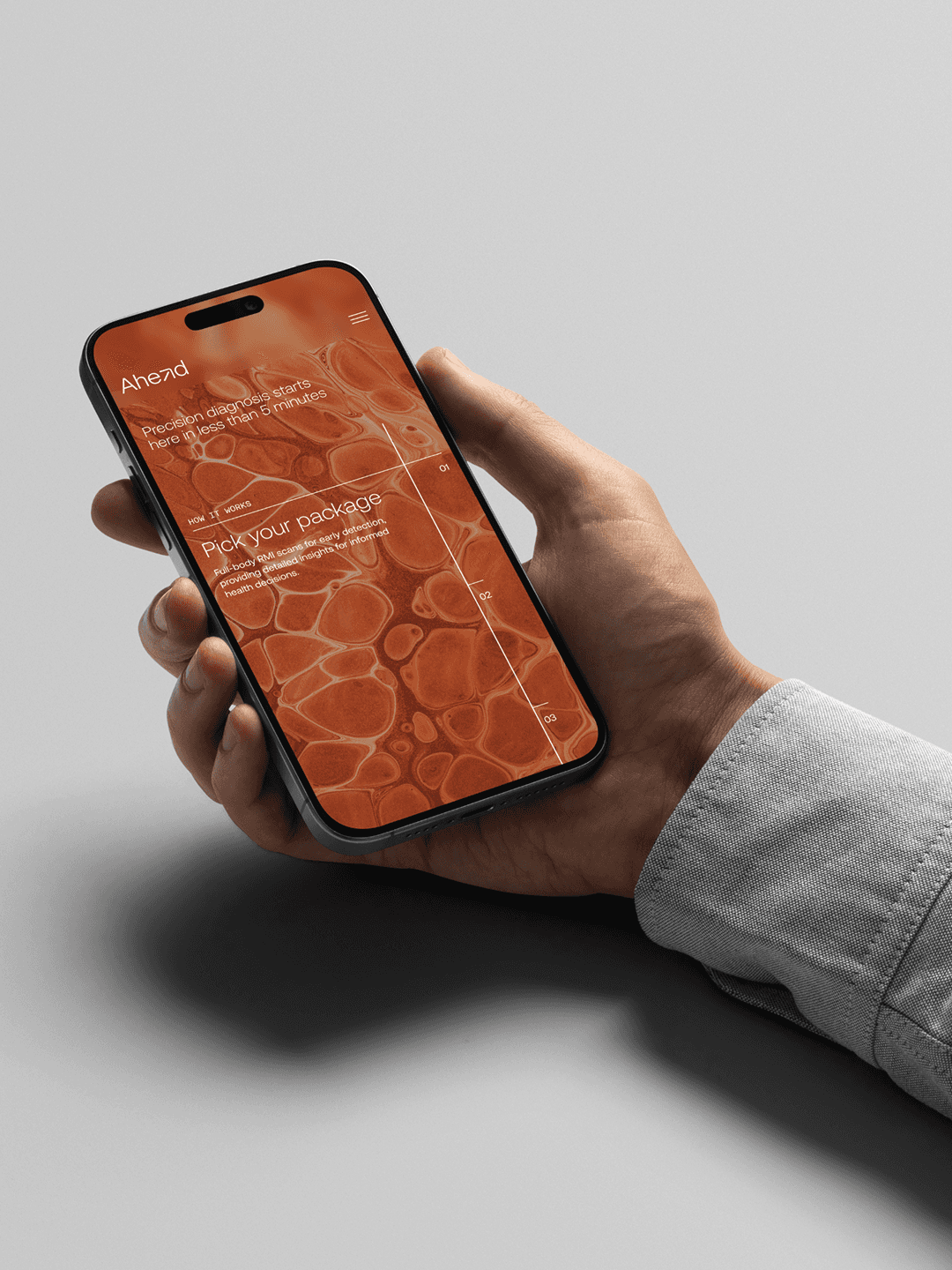
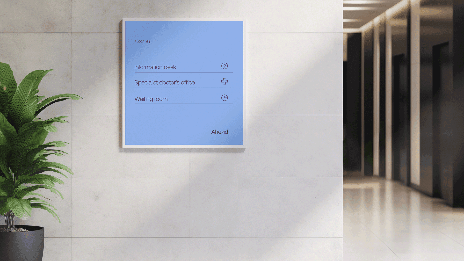
We anchored the system around a single creative concept, "from blur to clarity." The wordmark resolves into a forward-pointing arrow that doubles as the standalone logomark and seeds the geometry for a 16-grid icon system. The colour palette runs across three tonal families (blue, green, terracotta) plus a warm neutral, with strict pairing rules that make the system feel disciplined rather than decorative. The blur concept extends into the type itself: titles can resolve from blurred to sharp, with the most important word of the line always in focus. Photography pairs portraits of people in the target age range with textures that resemble macro and microscopic views of organic material, holding the human and scientific halves of the brand in the same frame.
OUR PROCESS
Single creative concept developed: "from blur to clarity"
Wordmark resolved into a forward-pointing arrow, seeding a 16-grid icon system
Colour palette built across three tonal families with strict pairing rules
Typography system where titles resolve from blurred to sharp
OUR TOOLS
Visual Concepts
Art Direction
Visual Identity
Logo Design
Typography
Colour Palette
Iconography
Photography Direction
Motion & Animation
Brand Guidelines & Toolkits

MAKING THE PRODUCT CLEARER THAN THE SCIENCE REQUIRES IT TO BE
The Challenge
A whole-body MRI plus an extended blood panel produces hundreds of data points. The clinical report a customer receives is dense, technical, and easy to misread. The risk: customers walk away from a transformative health screening with a document they file and never open. The website faces a parallel problem. Most preventive healthcare landing pages either oversell or retreat into clinical formality, neither of which converts a hesitant first-time buyer being asked to pay for something they have always been told their GP would handle.
What we did
In our initial proposal, the homepage used a scrollytelling structure where each section revealed one piece of the offering, with the focusing-layer technique running through the page as the dominant motion language, so the brand's central concept becomes the interaction itself. The screening dashboard is the document each customer receives after their annual visit, treated as a one-page interactive report rather than a multi-page PDF. In our explorations, a summary view at the top combines a body-system findings list with status flags, an MRI biomarker scatter showing readings against optimal, normal, out of normal, and at-risk ranges, and a parallel view for blood lab scores. Below that, deeper content opens on demand for any flagged finding. A timeline at the bottom shows how the same body will be tracked across subsequent annual visits, making the longitudinal model legible at a glance.
OUR PROCESS
Homepage built as a scrollytelling structure, revealing the offering section by section
Focusing-layer technique used as the dominant motion language throughout
Screening dashboard designed as a one-page interactive report, not a multi-page PDF
Summary view combining body-system findings, MRI biomarker scatter, and blood lab scores
OUR TOOLS
UX Strategy
User Journeys
Wireframing
UX Design
UI Design
Interaction Design
Responsive Web Design
design system
Motion & Animation
Conclusion
Ahead launched with a brand and digital product that held together from the first touchpoint to the screening dashboard.
The strategic foundation gave the team a clear position in a category that had no obvious template, and the visual system gave that position a coherent, recognisable form. The screening dashboard turned the most complex part of the product into its clearest proof point. Late last year, Ahead Health closed a $6M seed round led by RTP Global to scale the model across Europe.


Hungry for more insights?
Subscribe to our to stay up to date with industry standards.
Let’s talk
Ready to build something remarkable? We partner with ambitious teams who are serious about growth.
Contact Us
© 2026 Vicine
Your Health Revealed
AHEAD HEALTH
A brand for Europe's first AI-driven preventive healthcare program
Industry
Preventive Healthcare
Stage
Pre-Launch
Services
Naming • Brand Strategy • Brand Identity • UX/UI Design
Context
Ahead launched a category that barely existed in Europe: an annual, AI-supported preventive healthcare program combining whole-body MRI, extended blood panels, and continuous longitudinal monitoring. The clinical foundation was strong. The team are repeat founders and medtech experts with clinical partners across Switzerland and a credible scientific board. The brand had a harder job. It had to make proactive, paid prevention feel as natural as an annual checkup, while sitting between two reference points that both felt wrong: traditional healthcare, slow and institutional, and consumer wellness, loose with claims and light on science.
The work
We built the brand from zero across three connected workstreams. We ran a strategy process to define purpose, personality, target audiences, and messaging. We designed a complete visual identity organised around a single concept, "from blur to clarity," that turned the brand's central promise of insight into your own body into a graphic system. And we designed an initial version of the digital experience, including the homepage’s scrollytelling and the interactive screening dashboard customers receive after their annual visit.
Outcome and results
Ahead launched with a coherent identity and a working digital product, ready to onboard customers through a partner clinic network in the Zurich area. Following launch, Ahead Health closed a $6M seed round led by RTP Global to scale the model across Europe.
DEFINING WHAT AHEAD ACTUALLY STANDS FOR
The Challenge
Categories that sit between two established ones inherit the worst of both unless they take a deliberate position. Preventive healthcare in Europe is treated as either a niche concierge service for the wealthy or a vague wellness pitch dressed up with medical language. Ahead is neither. The brand needed a clear point of view with enough specificity that every later decision (visual, verbal, product) had a test to pass.
What we did
We worked through the strategic stack from the inside out. Stakeholder workshops with the founding team surfaced the company's why, how, and what, and a one-line descriptor. We also led the naming work and landed on Ahead, a single word that reads as both verb and destination, and that the eventual identity could resolve into a forward-pointing arrow.
Competitor analysis and benchmarking mapped how the category was being communicated and where the openings were. We built four target personas across the relevant age range, each with their own fears, motivations, and the specific objection that would convince them to commit to an annual program.
We wrote brand commitments and brand promises against each phase of the customer journey, then combined the inward values and outward communication into a single brand personality: a savvy partner that is present without being overbearing, expert without being clinical, a giver of good advice that never tips into judgement.
OUR PROCESS
Stakeholder workshops to surface the company's why, how, and what
Competitor analysis and benchmarking to map category openings
Four target personas built across the relevant age range
Brand commitments and promises written against each journey phase
OUR TOOLS
Benchmarking
Personas
Naming
Stakeholder Interview
Competitive Analysis
Brand Narrative
Brand positioning
Messaging
North Star & Purpose
Brand values
Brand Pillars
Brand Personality & Archetypes
BUILDING A VISUAL SYSTEM THAT EARNS THE WORD "PREVENTION"
The Challenge
Most healthcare branding looks the same: a soft blue, a clean sans-serif, a clinical photograph. Brands that try to escape this often overcorrect into wellness aesthetics that lose their clinical credibility. Ahead needed an identity that read as scientifically serious and quietly modern at the same time, distinct enough not to get filed next to either reference category.
What we did
We anchored the system around a single creative concept, "from blur to clarity." The wordmark resolves into a forward-pointing arrow that doubles as the standalone logomark and seeds the geometry for a 16-grid icon system. The colour palette runs across three tonal families (blue, green, terracotta) plus a warm neutral, with strict pairing rules that make the system feel disciplined rather than decorative. The blur concept extends into the type itself: titles can resolve from blurred to sharp, with the most important word of the line always in focus. Photography pairs portraits of people in the target age range with textures that resemble macro and microscopic views of organic material, holding the human and scientific halves of the brand in the same frame.
OUR PROCESS
Single creative concept developed: "from blur to clarity"
Wordmark resolved into a forward-pointing arrow, seeding a 16-grid icon system
Colour palette built across three tonal families with strict pairing rules
Typography system where titles resolve from blurred to sharp
OUR TOOLS
Visual Concepts
Art Direction
Visual Identity
Logo Design
Typography
Colour Palette
Iconography
Photography Direction
Motion & Animation
Brand Guidelines & Toolkits
MAKING THE PRODUCT CLEARER THAN THE SCIENCE REQUIRES IT TO BE
The Challenge
A whole-body MRI plus an extended blood panel produces hundreds of data points. The clinical report a customer receives is dense, technical, and easy to misread. The risk: customers walk away from a transformative health screening with a document they file and never open. The website faces a parallel problem. Most preventive healthcare landing pages either oversell or retreat into clinical formality, neither of which converts a hesitant first-time buyer being asked to pay for something they have always been told their GP would handle.
What we did
In our initial proposal, the homepage used a scrollytelling structure where each section revealed one piece of the offering, with the focusing-layer technique running through the page as the dominant motion language, so the brand's central concept becomes the interaction itself. The screening dashboard is the document each customer receives after their annual visit, treated as a one-page interactive report rather than a multi-page PDF. In our explorations, a summary view at the top combines a body-system findings list with status flags, an MRI biomarker scatter showing readings against optimal, normal, out of normal, and at-risk ranges, and a parallel view for blood lab scores. Below that, deeper content opens on demand for any flagged finding. A timeline at the bottom shows how the same body will be tracked across subsequent annual visits, making the longitudinal model legible at a glance.
OUR PROCESS
Homepage built as a scrollytelling structure, revealing the offering section by section
Focusing-layer technique used as the dominant motion language throughout
Screening dashboard designed as a one-page interactive report, not a multi-page PDF
Summary view combining body-system findings, MRI biomarker scatter, and blood lab scores
OUR TOOLS
UX Strategy
User Journeys
Wireframing
UX Design
UI Design
Interaction Design
Responsive Web Design
design system
Motion & Animation
Conclusion
Ahead launched with a brand and digital product that held together from the first touchpoint to the screening dashboard.
The strategic foundation gave the team a clear position in a category that had no obvious template, and the visual system gave that position a coherent, recognisable form. The screening dashboard turned the most complex part of the product into its clearest proof point. Late last year, Ahead Health closed a $6M seed round led by RTP Global to scale the model across Europe.
Hungry for more insights?
Subscribe to our to stay up to date with industry standards.
Let’s talk
Ready to build something remarkable? We partner with ambitious teams who are serious about growth.
Contact Us
© 2026 Vicine
Your Health Revealed
AHEAD HEALTH
A brand for Europe's first AI-driven preventive healthcare program
INDUSTRY
Preventive Healthcare
STAGE
Pre-Launch
SERVICES
Naming • Brand Strategy • Brand Identity • UX/UI Design
OBJECTIVES
Ahead launched a category that barely existed in Europe: an annual, AI-supported preventive healthcare program combining whole-body MRI, extended blood panels, and continuous longitudinal monitoring. The clinical foundation was strong. The team are repeat founders and medtech experts with clinical partners across Switzerland and a credible scientific board. The brand had a harder job. It had to make proactive, paid prevention feel as natural as an annual checkup, while sitting between two reference points that both felt wrong: traditional healthcare, slow and institutional, and consumer wellness, loose with claims and light on science.
OBJECTIVES
We built the brand from zero across three connected workstreams. We ran a strategy process to define purpose, personality, target audiences, and messaging. We designed a complete visual identity organised around a single concept, "from blur to clarity," that turned the brand's central promise of insight into your own body into a graphic system. And we designed an initial version of the digital experience, including the homepage’s scrollytelling and the interactive screening dashboard customers receive after their annual visit.
OBJECTIVES
Ahead launched with a coherent identity and a working digital product, ready to onboard customers through a partner clinic network in the Zurich area. Following launch, Ahead Health closed a $6M seed round led by RTP Global to scale the model across Europe.
DEFINING WHAT AHEAD ACTUALLY STANDS FOR
The Challenge
Categories that sit between two established ones inherit the worst of both unless they take a deliberate position. Preventive healthcare in Europe is treated as either a niche concierge service for the wealthy or a vague wellness pitch dressed up with medical language. Ahead is neither. The brand needed a clear point of view with enough specificity that every later decision (visual, verbal, product) had a test to pass.
What we did
We worked through the strategic stack from the inside out. Stakeholder workshops with the founding team surfaced the company's why, how, and what, and a one-line descriptor. We also led the naming work and landed on Ahead, a single word that reads as both verb and destination, and that the eventual identity could resolve into a forward-pointing arrow.
Competitor analysis and benchmarking mapped how the category was being communicated and where the openings were. We built four target personas across the relevant age range, each with their own fears, motivations, and the specific objection that would convince them to commit to an annual program.
We wrote brand commitments and brand promises against each phase of the customer journey, then combined the inward values and outward communication into a single brand personality: a savvy partner that is present without being overbearing, expert without being clinical, a giver of good advice that never tips into judgement.
OUR PROCESS
Stakeholder workshops to surface the company's why, how, and what
Competitor analysis and benchmarking to map category openings
Four target personas built across the relevant age range
Brand commitments and promises written against each journey phase
OUR TOOLS
Benchmarking
Personas
Naming
Stakeholder Interview
Competitive Analysis
Brand Narrative
Brand positioning
Messaging
North Star & Purpose
Brand values
Brand Pillars
Brand Personality & Archetypes
BUILDING A VISUAL SYSTEM THAT EARNS THE WORD "PREVENTION"
The Challenge
Most healthcare branding looks the same: a soft blue, a clean sans-serif, a clinical photograph. Brands that try to escape this often overcorrect into wellness aesthetics that lose their clinical credibility. Ahead needed an identity that read as scientifically serious and quietly modern at the same time, distinct enough not to get filed next to either reference category.
What we did
We anchored the system around a single creative concept, "from blur to clarity." The wordmark resolves into a forward-pointing arrow that doubles as the standalone logomark and seeds the geometry for a 16-grid icon system. The colour palette runs across three tonal families (blue, green, terracotta) plus a warm neutral, with strict pairing rules that make the system feel disciplined rather than decorative. The blur concept extends into the type itself: titles can resolve from blurred to sharp, with the most important word of the line always in focus. Photography pairs portraits of people in the target age range with textures that resemble macro and microscopic views of organic material, holding the human and scientific halves of the brand in the same frame.
OUR PROCESS
Single creative concept developed: "from blur to clarity"
Wordmark resolved into a forward-pointing arrow, seeding a 16-grid icon system
Colour palette built across three tonal families with strict pairing rules
Typography system where titles resolve from blurred to sharp
OUR TOOLS
Visual Concepts
Art Direction
Visual Identity
Logo Design
Typography
Colour Palette
Iconography
Photography Direction
Motion & Animation
Brand Guidelines & Toolkits
MAKING THE PRODUCT CLEARER THAN THE SCIENCE REQUIRES IT TO BE
The Challenge
A whole-body MRI plus an extended blood panel produces hundreds of data points. The clinical report a customer receives is dense, technical, and easy to misread. The risk: customers walk away from a transformative health screening with a document they file and never open. The website faces a parallel problem. Most preventive healthcare landing pages either oversell or retreat into clinical formality, neither of which converts a hesitant first-time buyer being asked to pay for something they have always been told their GP would handle.
What we did
In our initial proposal, the homepage used a scrollytelling structure where each section revealed one piece of the offering, with the focusing-layer technique running through the page as the dominant motion language, so the brand's central concept becomes the interaction itself. The screening dashboard is the document each customer receives after their annual visit, treated as a one-page interactive report rather than a multi-page PDF. In our explorations, a summary view at the top combines a body-system findings list with status flags, an MRI biomarker scatter showing readings against optimal, normal, out of normal, and at-risk ranges, and a parallel view for blood lab scores. Below that, deeper content opens on demand for any flagged finding. A timeline at the bottom shows how the same body will be tracked across subsequent annual visits, making the longitudinal model legible at a glance.
OUR PROCESS
Homepage built as a scrollytelling structure, revealing the offering section by section
Focusing-layer technique used as the dominant motion language throughout
Screening dashboard designed as a one-page interactive report, not a multi-page PDF
Summary view combining body-system findings, MRI biomarker scatter, and blood lab scores
OUR TOOLS
UX Strategy
User Journeys
Wireframing
UX Design
UI Design
Interaction Design
Responsive Web Design
design system
Motion & Animation
CONCLUSION
Ahead launched with a brand and digital product that held together from the first touchpoint to the screening dashboard.
The strategic foundation gave the team a clear position in a category that had no obvious template, and the visual system gave that position a coherent, recognisable form. The screening dashboard turned the most complex part of the product into its clearest proof point. Late last year, Ahead Health closed a $6M seed round led by RTP Global to scale the model across Europe.


Hungry for more insights?
Subscribe to our to stay up to date with industry standards.
Let’s talk
Ready to build something remarkable? We partner with ambitious teams who are serious about growth.
Contact Us
© 2026 Vicine