
SAMSUNG RESEARCH AMERICA
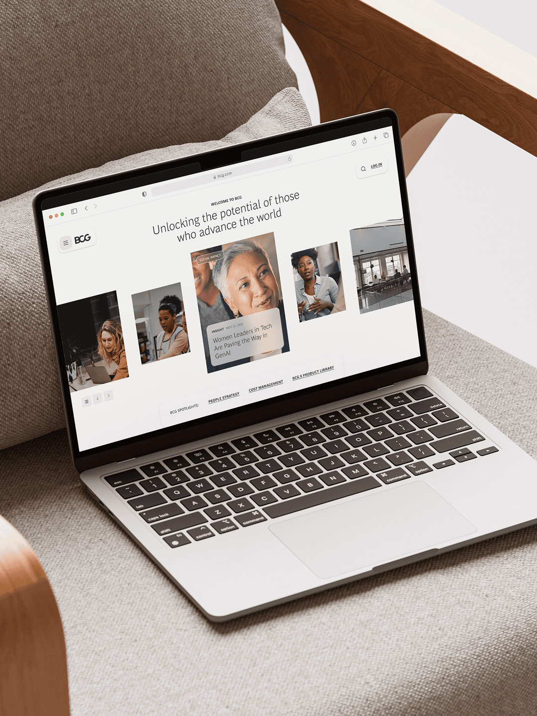
A complete rebrand for the commercial launch of Samsung's remote cardiac rehabilitation program
Industry
Healthcare, Digital Health
Stage
Pre-Commercial Launch
Services
Brand Strategy • Brand Identity • UX/UI Design
context
Samsung HeartWise is a remote cardiac rehabilitation program that had been validated through years of clinical trials before going to market. The brand and the communications around it had been built for patients already enrolled in the program. The commercial launch required something different: a brand that could convince medical decision-makers, the people who would adopt the program for their hospitals and pay for it, to take it seriously. The story being told no longer matched the audience it needed to reach.
the work
Vicine led a complete rebrand across strategy, identity, and applied design. We defined the brand's purpose, values, and personality, mapped the medical audiences who would shape adoption, and built a messaging architecture grounded in two arguments competitors could not borrow: Samsung's legitimacy and a human-centered point of view. We then designed a new visual system built around a two-part heart mark and extended it across a print and digital campaign, brochures, billboards, and applied collateral.
outcome
The work gave HeartWise a strategic foundation, a distinct visual presence within Samsung's parent system, and a campaign-ready brand language for entering a crowded category. The product has since launched commercially. Performance metrics are not available to share.
Reposition the brand for a new audience
The Challenge
HeartWise had been clinically proven over a multi-year trial, and the existing brand reflected that history. The website was a repository of patient tutorials. The visual language and the messaging spoke to people already inside the program, walking them through how to use it. Going to market commercially flipped the audience entirely. The brand now needed to convince the medical professionals and healthcare leaders who would decide whether to adopt the program in the first place. The product was ready. The brand had not been built for the people who would buy it.
What we did
We worked through the strategic stack from the inside out. Stakeholder workshops surfaced the team's own beliefs about the program. A landscape scan and competitor review mapped how the category was being communicated and where the openings were. From there we defined HeartWise's purpose, values, and one-sentence descriptor, built personas for the medical decision-makers most relevant to adoption, and shaped messaging tailored to each. The output was a strategic foundation that gave the brand a clear point of view before any visual work started.
OUR PROCESS
Ran stakeholder workshops to surface the team's own beliefs about the program before making any external claims
Scanned the competitive landscape to map how the category was being communicated and where the openings were
Built personas for the medical decision-makers most relevant to adoption
Shaped messaging tailored to each audience before any visual work started
OUR TOOLS
Stakeholder Interviews
Kickoff Workshops
Define Success Criteria
CONTENT audit
Brand audit
Competitive Scan
Brand Pillars
Desk Research
Competitive Analysis
Brand Positioning
Brand Narrative
benchmarking
Personas
Messaging
Brand Values
Visual Benchmarking
North Star & Purpose
Mission & Vision

Carve out a distinct voice in a crowded category
The Challenge
The competitor review surfaced a pattern. Roughly ten remote cardiac rehab providers were saying nearly the same thing: reduced readmissions, better adherence, clinical efficacy. The vocabulary had converged. Most operators sounded institutional, hedged, and interchangeable. The differentiation question for HeartWise was not what the program did. It was how the brand should sound, look, and feel relative to a field that had already settled on a shared register.
What we did
We anchored differentiation in two places competitors could not easily borrow. The first was Samsung itself. Most direct competitors are venture-stage healthcare startups. The parent brand brings credibility and long-term stability that no startup can claim, and we built that ownership into the structure of the brand rather than treating it as a logo placement. The second was the emotional register. We defined a brand personality grounded in care and human warmth, and built messaging around real outcomes rather than abstract clinical benefits. The "one heart at a time" line carried the point of view through the campaign.
OUR PROCESS
Audited roughly ten direct competitors to identify where the category vocabulary had converged
Identified the two differentiators competitors could not borrow: Samsung's legitimacy and a human-centered register
Defined a brand personality grounded in care and warmth rather than clinical distance
Built messaging around real outcomes, anchored in a single line that carried the point of view through the campaign
OUR TOOLS
Competitive Analysis
Visual Research
Brand Positioning
Brand Narrative
Messaging
brand Pillars
Brand Personality & Archetypes
Brand Voice & Tone Of Voice
Mood Boards


Design the identity and bring it to life
The Challenge
The visual system had to do three things at once. It had to feel modern and approachable in a category that defaults to clinical and sterile. It had to live within Samsung's parent brand guidelines without disappearing into them. And it had to extend across a wide range of touchpoints: campaign, brochure, web, apparel, signage, in a short window.
What we did
The logomark resolves into two halves of a heart, a small visual argument that the program is built on connection between therapist and patient, and between physical and digital care. The system runs on a primary purple palette with blue as a secondary, paired with a warm photography direction that treats patients and clinicians as people rather than archetypes. We extended the brand across a print and digital campaign, brochures, billboards, and applied collateral, and produced a complete brand foundation ready to deploy at launch.
OUR PROCESS
Designed a logomark that made a visual argument about the program, not just named it
Built a color and photography system that felt modern and warm without breaking from Samsung's parent guidelines
Extended the identity across campaign, brochure, web, apparel, and signage within a compressed timeline
Closed with a complete brand foundation and handover documentation ready to deploy at launch
OUR TOOLS
Visual Concepts
Art Direction
Visual Identity
Logo Design
Typography
Colour Palette
Iconography
Photography Direction
Brand Guidelines & Toolkits
Collateral & Stationery
UX Design
UI Design
Responsive Web Design
Stakeholder Handover Decks
Copywriting


“Vicine felt like an extension of our team from the first conversation. They asked the right questions, listened carefully, and pushed us to articulate things we hadn't yet put into words. The result is a brand we are proud of.”
Ken Honeycutt
Samsung Director of Healthcare, Commercialization


Hungry for more insights?
Subscribe to our to stay up to date with industry standards.
Let’s talk
Ready to build something remarkable? We partner with ambitious teams who are serious about growth.
Contact Us
© 2026 Vicine
SAMSUNG RESEARCH AMERICA
A complete rebrand for the commercial launch of Samsung's remote cardiac rehabilitation program
INDUSTRY
Healthcare, Digital Health
STAGE
Pre-Commercial Launch
SERVICES
Brand Strategy • Brand Identity • UX/UI Design
OBJECTIVES
Samsung HeartWise is a remote cardiac rehabilitation program that had been validated through years of clinical trials before going to market. The brand and the communications around it had been built for patients already enrolled in the program. The commercial launch required something different: a brand that could convince medical decision-makers, the people who would adopt the program for their hospitals and pay for it, to take it seriously. The story being told no longer matched the audience it needed to reach.
SUMMARY OF OUTCOME
Vicine led a complete rebrand across strategy, identity, and applied design. We defined the brand's purpose, values, and personality, mapped the medical audiences who would shape adoption, and built a messaging architecture grounded in two arguments competitors could not borrow: Samsung's legitimacy and a human-centered point of view. We then designed a new visual system built around a two-part heart mark and extended it across a print and digital campaign, brochures, billboards, and applied collateral.
SUMMARY OF OUTCOME
The work gave HeartWise a strategic foundation, a distinct visual presence within Samsung's parent system, and a campaign-ready brand language for entering a crowded category. The product has since launched commercially. Performance metrics are not available to share.
Reposition the brand for a new audience
The Challenge
HeartWise had been clinically proven over a multi-year trial, and the existing brand reflected that history. The website was a repository of patient tutorials. The visual language and the messaging spoke to people already inside the program, walking them through how to use it. Going to market commercially flipped the audience entirely. The brand now needed to convince the medical professionals and healthcare leaders who would decide whether to adopt the program in the first place. The product was ready. The brand had not been built for the people who would buy it.
What we did
We worked through the strategic stack from the inside out. Stakeholder workshops surfaced the team's own beliefs about the program. A landscape scan and competitor review mapped how the category was being communicated and where the openings were. From there we defined HeartWise's purpose, values, and one-sentence descriptor, built personas for the medical decision-makers most relevant to adoption, and shaped messaging tailored to each. The output was a strategic foundation that gave the brand a clear point of view before any visual work started.
OUR PROCESS
Ran stakeholder workshops to surface the team's own beliefs about the program before making any external claims
Scanned the competitive landscape to map how the category was being communicated and where the openings were
Built personas for the medical decision-makers most relevant to adoption
Shaped messaging tailored to each audience before any visual work started
OUR TOOLS
Stakeholder Interviews
Kickoff Workshops
Define Success Criteria
CONTENT audit
Brand audit
Competitive Scan
Brand Pillars
Desk Research
Competitive Analysis
Brand Positioning
Brand Narrative
benchmarking
Personas
Messaging
Brand Values
Visual Benchmarking
North Star & Purpose
Mission & Vision
Carve out a distinct voice in a crowded category
The Challenge
The competitor review surfaced a pattern. Roughly ten remote cardiac rehab providers were saying nearly the same thing: reduced readmissions, better adherence, clinical efficacy. The vocabulary had converged. Most operators sounded institutional, hedged, and interchangeable. The differentiation question for HeartWise was not what the program did. It was how the brand should sound, look, and feel relative to a field that had already settled on a shared register.
What we did
We anchored differentiation in two places competitors could not easily borrow. The first was Samsung itself. Most direct competitors are venture-stage healthcare startups. The parent brand brings credibility and long-term stability that no startup can claim, and we built that ownership into the structure of the brand rather than treating it as a logo placement. The second was the emotional register. We defined a brand personality grounded in care and human warmth, and built messaging around real outcomes rather than abstract clinical benefits. The "one heart at a time" line carried the point of view through the campaign.
OUR PROCESS
Audited roughly ten direct competitors to identify where the category vocabulary had converged
Identified the two differentiators competitors could not borrow: Samsung's legitimacy and a human-centered register
Defined a brand personality grounded in care and warmth rather than clinical distance
Built messaging around real outcomes, anchored in a single line that carried the point of view through the campaign
OUR TOOLS
Competitive Analysis
Visual Research
Brand Positioning
Brand Narrative
Messaging
brand Pillars
Brand Personality & Archetypes
Brand Voice & Tone Of Voice
Mood Boards
Design the identity and bring it to life
The Challenge
The visual system had to do three things at once. It had to feel modern and approachable in a category that defaults to clinical and sterile. It had to live within Samsung's parent brand guidelines without disappearing into them. And it had to extend across a wide range of touchpoints: campaign, brochure, web, apparel, signage, in a short window.
What we did
The logomark resolves into two halves of a heart, a small visual argument that the program is built on connection between therapist and patient, and between physical and digital care. The system runs on a primary purple palette with blue as a secondary, paired with a warm photography direction that treats patients and clinicians as people rather than archetypes. We extended the brand across a print and digital campaign, brochures, billboards, and applied collateral, and produced a complete brand foundation ready to deploy at launch.
OUR PROCESS
Designed a logomark that made a visual argument about the program, not just named it
Built a color and photography system that felt modern and warm without breaking from Samsung's parent guidelines
Extended the identity across campaign, brochure, web, apparel, and signage within a compressed timeline
Closed with a complete brand foundation and handover documentation ready to deploy at launch
OUR TOOLS
Visual Concepts
Art Direction
Visual Identity
Logo Design
Typography
Colour Palette
Iconography
Photography Direction
Brand Guidelines & Toolkits
Collateral & Stationery
UX Design
UI Design
Responsive Web Design
Stakeholder Handover Decks
Copywriting
“Vicine felt like an extension of our team from the first conversation. They asked the right questions, listened carefully, and pushed us to articulate things we hadn't yet put into words. The result is a brand we are proud of.”
Ken Honeycutt
CO-FOUNDER AT STARTUP

Hungry for more insights?
Subscribe to our to stay up to date with industry standards.
Let’s talk
Ready to build something remarkable? We partner with ambitious teams who are serious about growth.
Contact Us
© 2026 Vicine
SAMSUNG RESEARCH AMERICA
A complete rebrand for the commercial launch of Samsung's remote cardiac rehabilitation program
Industry
Healthcare, Digital Health
Stage
Pre-Commercial Launch
Services
Brand Strategy • Brand Identity • UX/UI Design
context
Samsung HeartWise is a remote cardiac rehabilitation program that had been validated through years of clinical trials before going to market. The brand and the communications around it had been built for patients already enrolled in the program. The commercial launch required something different: a brand that could convince medical decision-makers, the people who would adopt the program for their hospitals and pay for it, to take it seriously. The story being told no longer matched the audience it needed to reach.
the work
Vicine led a complete rebrand across strategy, identity, and applied design. We defined the brand's purpose, values, and personality, mapped the medical audiences who would shape adoption, and built a messaging architecture grounded in two arguments competitors could not borrow: Samsung's legitimacy and a human-centered point of view. We then designed a new visual system built around a two-part heart mark and extended it across a print and digital campaign, brochures, billboards, and applied collateral.
outcome
The work gave HeartWise a strategic foundation, a distinct visual presence within Samsung's parent system, and a campaign-ready brand language for entering a crowded category. The product has since launched commercially. Performance metrics are not available to share.
Reposition the brand for a new audience
The Challenge
HeartWise had been clinically proven over a multi-year trial, and the existing brand reflected that history. The website was a repository of patient tutorials. The visual language and the messaging spoke to people already inside the program, walking them through how to use it. Going to market commercially flipped the audience entirely. The brand now needed to convince the medical professionals and healthcare leaders who would decide whether to adopt the program in the first place. The product was ready. The brand had not been built for the people who would buy it.
What we did
We worked through the strategic stack from the inside out. Stakeholder workshops surfaced the team's own beliefs about the program. A landscape scan and competitor review mapped how the category was being communicated and where the openings were. From there we defined HeartWise's purpose, values, and one-sentence descriptor, built personas for the medical decision-makers most relevant to adoption, and shaped messaging tailored to each. The output was a strategic foundation that gave the brand a clear point of view before any visual work started.
OUR PROCESS
Ran stakeholder workshops to surface the team's own beliefs about the program before making any external claims
Scanned the competitive landscape to map how the category was being communicated and where the openings were
Built personas for the medical decision-makers most relevant to adoption
Shaped messaging tailored to each audience before any visual work started
OUR TOOLS
Stakeholder Interviews
Kickoff Workshops
Define Success Criteria
CONTENT audit
Brand audit
Competitive Scan
Brand Pillars
Desk Research
Competitive Analysis
Brand Positioning
Brand Narrative
benchmarking
Personas
Messaging
Brand Values
Visual Benchmarking
North Star & Purpose
Mission & Vision
Carve out a distinct voice in a crowded category
The Challenge
The competitor review surfaced a pattern. Roughly ten remote cardiac rehab providers were saying nearly the same thing: reduced readmissions, better adherence, clinical efficacy. The vocabulary had converged. Most operators sounded institutional, hedged, and interchangeable. The differentiation question for HeartWise was not what the program did. It was how the brand should sound, look, and feel relative to a field that had already settled on a shared register.
What we did
We anchored differentiation in two places competitors could not easily borrow. The first was Samsung itself. Most direct competitors are venture-stage healthcare startups. The parent brand brings credibility and long-term stability that no startup can claim, and we built that ownership into the structure of the brand rather than treating it as a logo placement. The second was the emotional register. We defined a brand personality grounded in care and human warmth, and built messaging around real outcomes rather than abstract clinical benefits. The "one heart at a time" line carried the point of view through the campaign.
OUR PROCESS
Audited roughly ten direct competitors to identify where the category vocabulary had converged
Identified the two differentiators competitors could not borrow: Samsung's legitimacy and a human-centered register
Defined a brand personality grounded in care and warmth rather than clinical distance
Built messaging around real outcomes, anchored in a single line that carried the point of view through the campaign
OUR TOOLS
Competitive Analysis
Visual Research
Brand Positioning
Brand Narrative
Messaging
brand Pillars
Brand Personality & Archetypes
Brand Voice & Tone Of Voice
Mood Boards
Design the identity and bring it to life
The Challenge
The visual system had to do three things at once. It had to feel modern and approachable in a category that defaults to clinical and sterile. It had to live within Samsung's parent brand guidelines without disappearing into them. And it had to extend across a wide range of touchpoints: campaign, brochure, web, apparel, signage, in a short window.
What we did
The logomark resolves into two halves of a heart, a small visual argument that the program is built on connection between therapist and patient, and between physical and digital care. The system runs on a primary purple palette with blue as a secondary, paired with a warm photography direction that treats patients and clinicians as people rather than archetypes. We extended the brand across a print and digital campaign, brochures, billboards, and applied collateral, and produced a complete brand foundation ready to deploy at launch.
OUR PROCESS
Designed a logomark that made a visual argument about the program, not just named it
Built a color and photography system that felt modern and warm without breaking from Samsung's parent guidelines
Extended the identity across campaign, brochure, web, apparel, and signage within a compressed timeline
Closed with a complete brand foundation and handover documentation ready to deploy at launch
OUR TOOLS
Visual Concepts
Art Direction
Visual Identity
Logo Design
Typography
Colour Palette
Iconography
Photography Direction
Brand Guidelines & Toolkits
Collateral & Stationery
UX Design
UI Design
Responsive Web Design
Stakeholder Handover Decks
Copywriting
“Vicine felt like an extension of our team from the first conversation. They asked the right questions, listened carefully, and pushed us to articulate things we hadn't yet put into words. The result is a brand we are proud of.”
Ken Honeycutt
Samsung Director of Healthcare, Commercialization
Hungry for more insights?
Subscribe to our to stay up to date with industry standards.
Let’s talk
Ready to build something remarkable? We partner with ambitious teams who are serious about growth.
Contact Us
© 2026 Vicine