OPTIMAL
A brand that turned a merger into identity
Industry
Digital Media
Stage
Enterprise
Services
Brand Strategy • Brand Identity • UX Design • UI Design • Illustration • Motion & Animation • Website Content • Frontend Development
Problem
Optimal was born in 2022 from the merger of four established digital media companies: DSPolitical, Optimad, UNTU, and Effective Spend. Each had its own client base, its own industry focus, and its own way of talking about what it did. The new entity needed a unified brand, but the challenge was that no single legacy company's identity could stretch to cover the others. There was no existing visual language, narrative, or positioning that felt like it belonged to all four at once.
outcome
We defined a brand strategy and narrative that incorporated the values of the four companies without diluting any of them, then built a complete visual identity and website to bring it to life. The identity centres on the concept of purposeful growth, expressed through a flexible logo system of five symbols (Purpose, Change, Impact, Growth, Action) that morph to reflect different aspects of the company's mission. We designed and developed the website end-to-end, including custom illustrations, animations, and all site content, using a headless WordPress and Node.js architecture.
Results
The website received an Awwwards honorable mention. More importantly, Optimal now operates under a single recognisable identity that has elevated all four legacy companies, giving them a shared language and visual system that none of them had before the merger.

Build a brand from four separate companies
The Challenge
Merging four companies means merging four cultures, four vocabularies, and four sets of assumptions about what the brand should say. Each of the legacy companies had built its reputation in a different industry. Finding a narrative that honoured what each brought to the table, without sounding like a compromise or a lowest common denominator, was the core problem. This wasn't a rebrand, but rather a new brand built from parts that had never been designed to fit together.
What we did
We worked directly with key stakeholders across the merging entities to understand what each company valued and where those values overlapped. We researched the target audiences and ran a thorough competitive analysis of the digital media landscape to understand how Optimal needed to position itself.
From that work, we defined a brand personality ("The Expert Enabler"), a tone of voice, a set of values, and a narrative anchored in the idea of purposeful growth. This strategic foundation shaped everything that followed: it informed the visual identity, the website structure, and the content.
OUR PROCESS
Interviewed key stakeholders across all four merging entities to map where values overlapped
Ran a competitive analysis to understand how Optimal needed to position itself in digital media
Defined a brand personality, tone of voice, and values that none of the four legacy brands could claim alone
Anchored everything in a single strategic idea — purposeful growth — that the visual work could build from
OUR TOOLS
Stakeholder Interviews
Competitive Analysis
Brand Narrative
Brand Values
Brand Personality & Archetypes
Brand Voice & Tone Of Voice


Create a visual identity that flexes without breaking
The Challenge
A merged company in digital media needs to speak credibly to audiences across multiple industries. A static logo and a fixed visual system would force everything into one register. The identity needed to be recognisable as one brand while adapting to different contexts, messages, and audiences.
What we did
We designed a logo system built around five core symbols, each representing one of Optimal's values: Purpose, Change, Impact, Growth, and Action. The logo can morph between these shapes, giving the brand a visual vocabulary rather than a single mark. These symbols work both as part of the logo and as standalone graphic elements across the company's materials: business cards, notebooks, tote bags, posters, and digital applications.
The visual language pairs a bold orange with a dark navy palette, clean sans-serif typography, and the symbol system as a repeating graphic motif. The result is a brand that feels cohesive across touchpoints while carrying enough flexibility to adapt to Optimal's range of industry verticals.
OUR PROCESS
Designed a logo system around five symbols, each tied to one of Optimal's core values
Built the symbols to work both as part of the logo and as standalone graphic elements
Extended the visual language into a repeating motif across print and digital applications
Documented the system so it could adapt across industry verticals without losing coherence
OUR TOOLS
Visual Identity
Logo Design
Typography
Colour Palette
Graphic System
Illustration
Motion & Animation


Design and build a website that converts
The Challenge
Optimal needed a website that did more than look like the new brand. It needed to communicate a clear message to audiences who had never heard of the company, explain what Optimal does across multiple industry verticals (healthcare, public affairs, consumer, and more), and convert visitors into leads. The content didn't exist yet, the IA hadn't been defined, and the site needed to work for both broad audiences and industry-specific prospects.
What we did
We started by defining the business goals the site needed to achieve, then researched target audience needs and behaviours to inform the user journeys and site structure. We designed wireframes for every key page type, working through the information architecture in close collaboration with the client's CEO.
We wrote the site content in collaboration with a dedicated copywriter, shaping the messaging section by section to make sure the brand narrative carried through every page. The UI extended the brand identity further with custom illustrations and animations that brought the symbol system to life on screen.
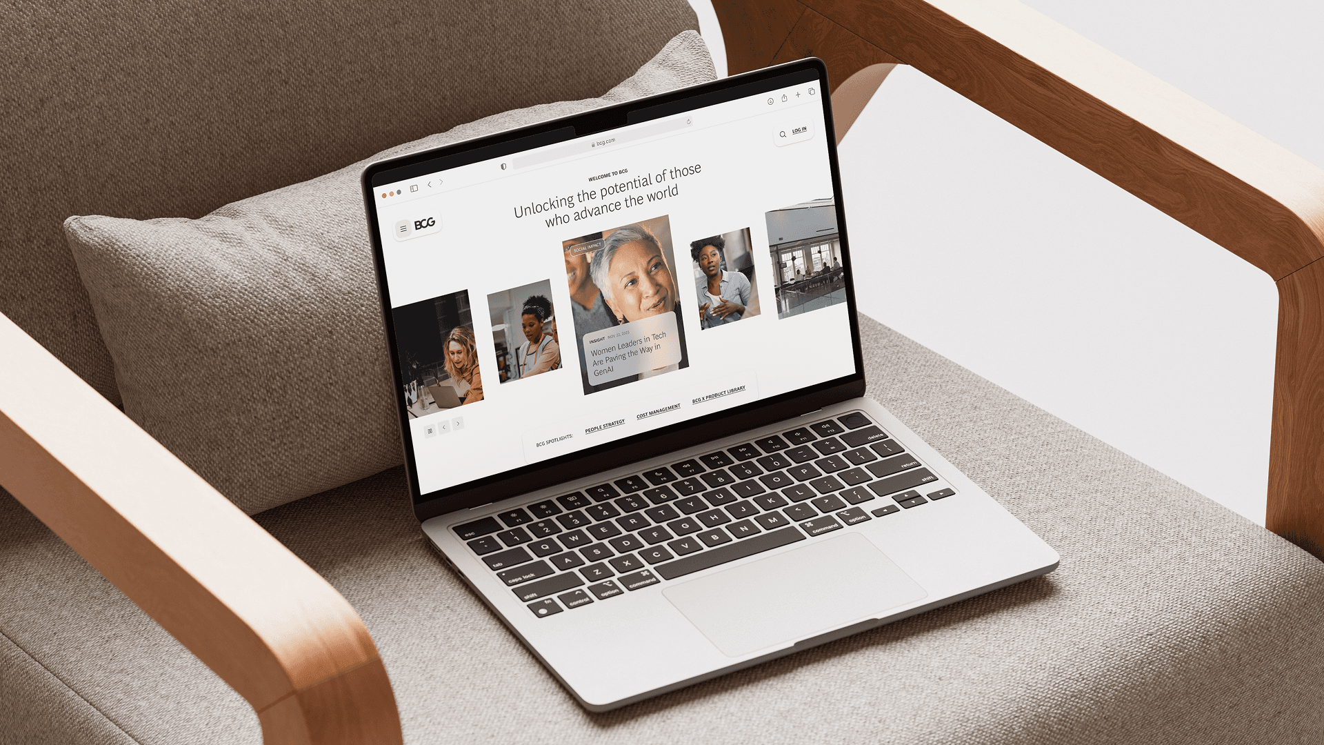
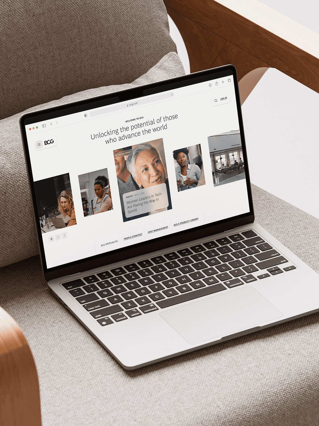
We built the site ourselves using a headless approach with WordPress and Node.js, giving Optimal a content-managed site with strong frontend performance.
OUR PROCESS
Defined the business goals the site needed to hit before touching layout or content
Researched target audience behaviors to inform user journeys and information architecture
Wrote site content in collaboration with a copywriter, section by section, against the brand narrative
Built the site headless, then extended the identity through custom illustrations and animations
OUR TOOLS
UX Design
User Journeys
Responsive Web Design
UI Design
Wireframing
Website Content
Illustration
Motion & Animation
WordPress Development
Frontend Development


“The brief was complex, and Vicine didn’t shy away from it. They pushed the work further than I expected, and in the moments where I wanted to pull back, their instincts turned out to be right. We created a true partnership, and I'd work with them again without hesitation.”
Michael Bassik
CEO, OPTIMAL


Hungry for more insights?
Subscribe to our to stay up to date with industry standards.
Let’s talk
Ready to build something remarkable? We partner with ambitious teams who are serious about growth.
Contact Us
© 2026 Vicine
OPTIMAL
A brand that turned a merger into identity
INDUSTRY
Digital Media
STAGE
Enterprise
SERVICES
Brand Strategy • Brand Identity • UX Design • UI Design • Illustration • Motion & Animation • Website Content • Frontend Development
OBJECTIVES
Optimal was born in 2022 from the merger of four established digital media companies: DSPolitical, Optimad, UNTU, and Effective Spend. Each had its own client base, its own industry focus, and its own way of talking about what it did. The new entity needed a unified brand, but the challenge was that no single legacy company's identity could stretch to cover the others. There was no existing visual language, narrative, or positioning that felt like it belonged to all four at once.
OBJECTIVES
We defined a brand strategy and narrative that incorporated the values of the four companies without diluting any of them, then built a complete visual identity and website to bring it to life. The identity centres on the concept of purposeful growth, expressed through a flexible logo system of five symbols (Purpose, Change, Impact, Growth, Action) that morph to reflect different aspects of the company's mission. We designed and developed the website end-to-end, including custom illustrations, animations, and all site content, using a headless WordPress and Node.js architecture.
SUMMARY OF OUTCOME
The website received an Awwwards honorable mention. More importantly, Optimal now operates under a single recognisable identity that has elevated all four legacy companies, giving them a shared language and visual system that none of them had before the merger.
Build a brand from four separate companies
The Challenge
Merging four companies means merging four cultures, four vocabularies, and four sets of assumptions about what the brand should say. Each of the legacy companies had built its reputation in a different industry. Finding a narrative that honoured what each brought to the table, without sounding like a compromise or a lowest common denominator, was the core problem. This wasn't a rebrand, but rather a new brand built from parts that had never been designed to fit together.
What we did
We worked directly with key stakeholders across the merging entities to understand what each company valued and where those values overlapped. We researched the target audiences and ran a thorough competitive analysis of the digital media landscape to understand how Optimal needed to position itself.
From that work, we defined a brand personality ("The Expert Enabler"), a tone of voice, a set of values, and a narrative anchored in the idea of purposeful growth. This strategic foundation shaped everything that followed: it informed the visual identity, the website structure, and the content.
OUR PROCESS
Interviewed key stakeholders across all four merging entities to map where values overlapped
Ran a competitive analysis to understand how Optimal needed to position itself in digital media
Defined a brand personality, tone of voice, and values that none of the four legacy brands could claim alone
Anchored everything in a single strategic idea — purposeful growth — that the visual work could build from
OUR TOOLS
Stakeholder Interviews
Competitive Analysis
Brand Narrative
Brand Values
Brand Personality & Archetypes
Brand Voice & Tone Of Voice
Create a visual identity that flexes without breaking
The Challenge
A merged company in digital media needs to speak credibly to audiences across multiple industries. A static logo and a fixed visual system would force everything into one register. The identity needed to be recognisable as one brand while adapting to different contexts, messages, and audiences.
What we did
We designed a logo system built around five core symbols, each representing one of Optimal's values: Purpose, Change, Impact, Growth, and Action. The logo can morph between these shapes, giving the brand a visual vocabulary rather than a single mark. These symbols work both as part of the logo and as standalone graphic elements across the company's materials: business cards, notebooks, tote bags, posters, and digital applications.
The visual language pairs a bold orange with a dark navy palette, clean sans-serif typography, and the symbol system as a repeating graphic motif. The result is a brand that feels cohesive across touchpoints while carrying enough flexibility to adapt to Optimal's range of industry verticals.
OUR PROCESS
Designed a logo system around five symbols, each tied to one of Optimal's core values
Built the symbols to work both as part of the logo and as standalone graphic elements
Extended the visual language into a repeating motif across print and digital applications
Documented the system so it could adapt across industry verticals without losing coherence
OUR TOOLS
Visual Identity
Logo Design
Typography
Colour Palette
Graphic System
Illustration
Motion & Animation
Design and build a website that converts
The Challenge
Optimal needed a website that did more than look like the new brand. It needed to communicate a clear message to audiences who had never heard of the company, explain what Optimal does across multiple industry verticals (healthcare, public affairs, consumer, and more), and convert visitors into leads. The content didn't exist yet, the IA hadn't been defined, and the site needed to work for both broad audiences and industry-specific prospects.
What we did
We started by defining the business goals the site needed to achieve, then researched target audience needs and behaviours to inform the user journeys and site structure. We designed wireframes for every key page type, working through the information architecture in close collaboration with the client's CEO.
We wrote the site content in collaboration with a dedicated copywriter, shaping the messaging section by section to make sure the brand narrative carried through every page. The UI extended the brand identity further with custom illustrations and animations that brought the symbol system to life on screen.
We built the site ourselves using a headless approach with WordPress and Node.js, giving Optimal a content-managed site with strong frontend performance.
OUR PROCESS
Defined the business goals the site needed to hit before touching layout or content
Researched target audience behaviors to inform user journeys and information architecture
Wrote site content in collaboration with a copywriter, section by section, against the brand narrative
Built the site headless, then extended the identity through custom illustrations and animations
OUR TOOLS
UX Design
User Journeys
Responsive Web Design
UI Design
Wireframing
Website Content
Illustration
Motion & Animation
WordPress Development
Frontend Development
“The brief was complex, and Vicine didn’t shy away from it. They pushed the work further than I expected, and in the moments where I wanted to pull back, their instincts turned out to be right. We created a true partnership, and I'd work with them again without hesitation.”
Michael Bassik
CO-FOUNDER AT STARTUP


Hungry for more insights?
Subscribe to our to stay up to date with industry standards.
Let’s talk
Ready to build something remarkable? We partner with ambitious teams who are serious about growth.
Contact Us
© 2026 Vicine
OPTIMAL
A brand that turned a merger into identity
Industry
Digital Media
Stage
Enterprise
Services
Brand Strategy • Brand Identity • UX Design • UI Design • Illustration • Motion & Animation • Website Content • Frontend Development
Problem
Optimal was born in 2022 from the merger of four established digital media companies: DSPolitical, Optimad, UNTU, and Effective Spend. Each had its own client base, its own industry focus, and its own way of talking about what it did. The new entity needed a unified brand, but the challenge was that no single legacy company's identity could stretch to cover the others. There was no existing visual language, narrative, or positioning that felt like it belonged to all four at once.
outcome
We defined a brand strategy and narrative that incorporated the values of the four companies without diluting any of them, then built a complete visual identity and website to bring it to life. The identity centres on the concept of purposeful growth, expressed through a flexible logo system of five symbols (Purpose, Change, Impact, Growth, Action) that morph to reflect different aspects of the company's mission. We designed and developed the website end-to-end, including custom illustrations, animations, and all site content, using a headless WordPress and Node.js architecture.
Results
The website received an Awwwards honorable mention. More importantly, Optimal now operates under a single recognisable identity that has elevated all four legacy companies, giving them a shared language and visual system that none of them had before the merger.
Build a brand from four separate companies
The Challenge
Merging four companies means merging four cultures, four vocabularies, and four sets of assumptions about what the brand should say. Each of the legacy companies had built its reputation in a different industry. Finding a narrative that honoured what each brought to the table, without sounding like a compromise or a lowest common denominator, was the core problem. This wasn't a rebrand, but rather a new brand built from parts that had never been designed to fit together.
What we did
We worked directly with key stakeholders across the merging entities to understand what each company valued and where those values overlapped. We researched the target audiences and ran a thorough competitive analysis of the digital media landscape to understand how Optimal needed to position itself.
From that work, we defined a brand personality ("The Expert Enabler"), a tone of voice, a set of values, and a narrative anchored in the idea of purposeful growth. This strategic foundation shaped everything that followed: it informed the visual identity, the website structure, and the content.
OUR PROCESS
Interviewed key stakeholders across all four merging entities to map where values overlapped
Ran a competitive analysis to understand how Optimal needed to position itself in digital media
Defined a brand personality, tone of voice, and values that none of the four legacy brands could claim alone
Anchored everything in a single strategic idea — purposeful growth — that the visual work could build from
OUR TOOLS
Stakeholder Interviews
Competitive Analysis
Brand Narrative
Brand Values
Brand Personality & Archetypes
Brand Voice & Tone Of Voice
Create a visual identity that flexes without breaking
The Challenge
A merged company in digital media needs to speak credibly to audiences across multiple industries. A static logo and a fixed visual system would force everything into one register. The identity needed to be recognisable as one brand while adapting to different contexts, messages, and audiences.
What we did
We designed a logo system built around five core symbols, each representing one of Optimal's values: Purpose, Change, Impact, Growth, and Action. The logo can morph between these shapes, giving the brand a visual vocabulary rather than a single mark. These symbols work both as part of the logo and as standalone graphic elements across the company's materials: business cards, notebooks, tote bags, posters, and digital applications.
The visual language pairs a bold orange with a dark navy palette, clean sans-serif typography, and the symbol system as a repeating graphic motif. The result is a brand that feels cohesive across touchpoints while carrying enough flexibility to adapt to Optimal's range of industry verticals.
OUR PROCESS
Designed a logo system around five symbols, each tied to one of Optimal's core values
Built the symbols to work both as part of the logo and as standalone graphic elements
Extended the visual language into a repeating motif across print and digital applications
Documented the system so it could adapt across industry verticals without losing coherence
OUR TOOLS
Visual Identity
Logo Design
Typography
Colour Palette
Graphic System
Illustration
Motion & Animation
Design and build a website that converts
The Challenge
Optimal needed a website that did more than look like the new brand. It needed to communicate a clear message to audiences who had never heard of the company, explain what Optimal does across multiple industry verticals (healthcare, public affairs, consumer, and more), and convert visitors into leads. The content didn't exist yet, the IA hadn't been defined, and the site needed to work for both broad audiences and industry-specific prospects.
What we did
We started by defining the business goals the site needed to achieve, then researched target audience needs and behaviours to inform the user journeys and site structure. We designed wireframes for every key page type, working through the information architecture in close collaboration with the client's CEO.
We wrote the site content in collaboration with a dedicated copywriter, shaping the messaging section by section to make sure the brand narrative carried through every page. The UI extended the brand identity further with custom illustrations and animations that brought the symbol system to life on screen.
We built the site ourselves using a headless approach with WordPress and Node.js, giving Optimal a content-managed site with strong frontend performance.
OUR PROCESS
Defined the business goals the site needed to hit before touching layout or content
Researched target audience behaviors to inform user journeys and information architecture
Wrote site content in collaboration with a copywriter, section by section, against the brand narrative
Built the site headless, then extended the identity through custom illustrations and animations
OUR TOOLS
UX Design
User Journeys
Responsive Web Design
UI Design
Wireframing
Website Content
Illustration
Motion & Animation
WordPress Development
Frontend Development
“The brief was complex, and Vicine didn’t shy away from it. They pushed the work further than I expected, and in the moments where I wanted to pull back, their instincts turned out to be right. We created a true partnership, and I'd work with them again without hesitation.”
Michael Bassik
CEO, OPTIMAL
Hungry for more insights?
Subscribe to our to stay up to date with industry standards.
Let’s talk
Ready to build something remarkable? We partner with ambitious teams who are serious about growth.
Contact Us
© 2026 Vicine